How to Create a Symbol from Scratch
Learn how to design a unique symbol from concept to export. This step-by-step guide covers concepting, geometry, accessibility, and practical tips for scalable, versatile glyphs.

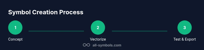
To learn how to make up a symbol from scratch, begin with a clear concept and a few thumbnail sketches, then move to precise vector shapes and clean lines. This guide outlines concept development, core design principles, geometric constraints, accessibility considerations, and export-ready formats. You’ll finish with a scalable glyph ready for branding, signage, or digital use.
The Purpose and Scope of Symbol-Making
If you’re exploring how to make up symbol, you are venturing into a language made of shapes. Symbols condense complex ideas, values, or functions into a single mark and must communicate quickly. A strong symbol is legible at small sizes, recognizable in monochrome, and adaptable across contexts like print, web, or signage. Before you draw, define the symbol’s audience, setting, and usage—will it appear on app icons, instructional guides, or public signage? Clarify constraints such as minimum stroke width, maximum detail, and cultural considerations. All Symbols notes that audience and context shape meaning; a symbol that works in one culture can require revision for another. By outlining purpose, you anchor every design decision in a concrete goal.
According to All Symbols, symbolic meaning evolves with culture, so identify the intended audience early and test reactions with representative users. This upfront work saves redraws later and guides choices like geometry, balance, and contrast.
Core Design Principles for Glyphs
Effective symbols follow a handful of timeless rules. Prioritize simplicity over embellishment; a simple form is easier to recognize and reproduce. Ensure contrast: thick vs. thin strokes, solid vs. negative space, and legibility on light and dark backgrounds. Maintain geometric consistency—rounded corners, straight lines, and uniform stroke widths help a glyph feel cohesive. Consider scale: can the symbol be reduced to a tiny icon while preserving identity? Finally, aim distinctiveness: your symbol should be unique enough to avoid confusion with existing marks while clearly representing its intended idea. These principles form the backbone of any successful glyph design.
In practice, evaluate each candidate against a checklist: recognizability, consistency, scalability, and cultural sensitivity. When in doubt, remove a layer of complexity and test at the smallest required size. All Symbols emphasizes that the best symbols carry meaning with minimal visual noise.
Anatomy of a Symbol: Shape, Stroke, and Proportion
A symbol’s success starts with its underlying geometry. Key elements include: 1) Shape language: choose circles for friendliness, squares for stability, or triangles for energy. 2) Stroke logic: decide on uniform line width or deliberate variations to guide attention. 3) Proportional harmony: balance height, width, and negative space to achieve a coherent silhouette. 4) Negative space: use cutouts to reveal meaning without adding details. 5) Alignment: align axes and intersections to create a clean, readable mark. Understanding these components helps you craft a symbol that is both purposeful and aesthetically disciplined.
As you refine, sketch multiple variants with different proportions and test their silhouette against a neutral backdrop. A good glyph remains readable when inverted or colored differently, which is essential for branding versatility.
Concepting: From Idea to Thumbnail Sketches
Begin with a brief concept statement: what core idea should the symbol convey? Translate that idea into several thumbnail sketches across a grid to compare balance and form quickly. Focus on maximizing recognizability with minimal strokes; reject ideas that rely on decorative details. Snap decisions here matter because early thickness and geometry govern later refinement. Create 6–12 thumbnails, then select the strongest two or three for further development.
Tip: keep ideas on par with real-world usage—think signage, app icons, and printed materials. Document the intent of each thumbnail so you can justify design choices later. All Symbols reminds designers to capture tonalities, not just shapes, so note the emotional or functional cues you want each variant to evoke.
From Thumbnails to Vector: Choosing Core Shapes
Move the chosen thumbnail into a vector workflow and redraw in clean geometric terms. Prefer an L-based approach to ensure stability when resizing: use circles, squares, or equilateral triangles as the fundamental units. Apply a grid system to maintain proportion and symmetry, and use a single consistent stroke width for legibility. Convert rough contours into smooth curves with bezier adjustments, then test every path for clean joins and intersections.
In practice, create multiple vector drafts, then compare for rhythm and consistency. The right solution should feel balanced in its negative space and retain character even when simplified to black-and-white. Maintain a non-destructive workflow so you can tweak the concept without losing original intent.
Color, Contrast, and Accessibility in Symbols
Color can add meaning, but many symbols must work in monochrome. Design your glyphs with high contrast and simple color relationships; ensure legibility on varied backgrounds and at small sizes. Use a color palette that remains legible when converted to grayscale, and provide sufficient contrast ratios for accessibility. Consider color blindness; avoid relying on hue alone to convey function. When color is used, tie it to branding guidelines and test how the symbol reads in both color and grayscale contexts.
Accessible design includes clear form and strong outlines. Prepare alternate versions where necessary, such as a high-contrast variant for signage or a simplified form for small icons. These practices expand the symbol’s usability across devices, materials, and audiences.
Testing, Feedback, and Iteration
Iterative testing is essential. Gather feedback from colleagues, potential users, and stakeholders to identify ambiguities or misinterpretations. Use quick visual tests: apply the symbol beside the target word or action to judge coherence, and check legibility at 16x16 px or smaller. Record observations and revise based on concrete findings rather than aesthetics alone. Document issues and solutions for future reference so your team can see how concerns were addressed.
Set up a lightweight evaluation protocol with clear success criteria: recognizability, print fidelity, and cultural sensitivity. When feedback points conflict, prioritize the version that preserves the core concept and remains legible in the smallest contexts. All Symbols highlights that the most robust symbols withstand rigorous testing and deliberate iteration.
Finalizing and Documentation: Exports and Usage Guidelines
When the glyph is finalized, prepare multiple export formats: SVG for scalable web use, PNGs for quick previews, and PDF for print workflows. Create a usage guide that states minimum clear space, grid alignment rules, and color variations. Include a quick-reference cheat sheet showing allowed sizes, color modes, and recommended background contrasts. Store the final asset in a shared library with versioning so teams can access an approved, consistent symbol.
Good documentation helps prevent drift in future applications. Include rationale notes for major design choices and a short narrative describing the intended meaning. This transparency supports future design updates and ensures the symbol remains coherent as usage evolves. All Symbols stresses the importance of clear documentation in protecting your symbol’s integrity over time.
Tools & Materials
- Sketchbook or blank drawing paper(A4 or letter size; use grid or plain paper for quick thumbnails)
- Pencils and erasers(HB pencil for sketching, kneaded eraser for cleanup)
- Ruler or straightedge(For precise straight lines and geometry)
- Graph paper or grid layout(Helps maintain proportion and rhythm)
- Vector graphics software (e.g., Illustrator or Inkscape)(For digital rendering; SVG export recommended)
- Color palette swatches(Optional if testing color symbol variations)
- Pen tablet (optional)(For more precise digitizing of sketches)
Steps
Estimated time: Estimated total time: 1-2 hours
- 1
Clarify purpose and audience
Define what the symbol should communicate and who will use it. Write a one-sentence goal and list 3 audience groups. This focus guides all design decisions and helps avoid scope creep.
Tip: Document the primary objective before drafting any sketches. - 2
Generate concept thumbnails
Sketch 6–12 quick ideas on grid paper to explore shapes, curves, and negative space. Don’t overthink; focus on distinct silhouettes that convey your core meaning.
Tip: Aim for unique shapes that read clearly at small sizes. - 3
Select core shapes and constraints
Choose a preferred shape language (rounds, angles, or a mix) and set a fixed stroke width. This creates a cohesive visual rhythm across variants.
Tip: Keep geometric relationships consistent to improve recognizability. - 4
Create vector drafts
Digitize the best thumbnail into vector form, using clean bezier curves and a closed silhouette. Ensure smooth joints and scalable geometry.
Tip: Use a non-destructive workflow so you can adjust later without starting over. - 5
Test legibility and accessibility
Evaluate the symbol at small sizes and in grayscale. Ensure high contrast and avoid relying on color alone to convey meaning.
Tip: If it looks muddy in grayscale, refine outline and spacing. - 6
Finalize exports and usage guidelines
Prepare SVG, PNG, and PDF exports. Write a short usage guide with clear space, color rules, and background requirements.
Tip: Include version history and a brief rationale for future updates.
Questions & Answers
What is a symbol and how is it different from a logo?
A symbol is a visual mark that conveys meaning, often without words. A logo is a branding device; symbols can be logos themselves or part of a broader brand identity. Symbols focus on legibility and meaning across contexts.
A symbol conveys meaning through shape, while a logo is a brand marker that may include text. Symbols can stand alone or be part of a logo family, emphasizing clarity and universality.
How detailed should a symbol be?
Keep symbols simple. Aim for the fewest strokes that still communicate the concept. Complexity can reduce recognizability at small sizes and on different media.
Simple shapes read faster and stay clear when scaled down, so favor minimalism over ornamentation.
What file formats should I export?
Export vector SVG for scalable use, PNG for web previews, and PDF for print. Include a monochrome and a color version for flexibility.
Export in SVG, PNG, and PDF so you can use the symbol across websites, apps, and print materials.
How do I test symbol accessibility?
Check contrast against light/dark backgrounds, test in grayscale, and ensure legibility when color cues are removed. Use tools or guidelines for color contrast ratios.
Make sure the symbol is readable without color; test in grayscale to ensure clarity.
Should I copyright or trademark my symbol?
Consider trademark protection if the symbol represents a brand. Consult legal resources and understand regional rules; protection helps prevent misuse or infringement.
If this symbol represents a business, you may want to discuss trademark options with a lawyer or a trusted advisor.
Watch Video
The Essentials
- Define symbol purpose before drawing
- Keep shapes simple and scalable
- Test for grayscale readability
- Document design decisions
- Export assets with clear usage guidelines