How to Make Symbols: A Designer's Comprehensive Guide
Master the art of symbol creation with a practical, step-by-step approach. Define purpose, sketch concepts, render in vector, test accessibility, and apply symbols across math, icons, and daily life.

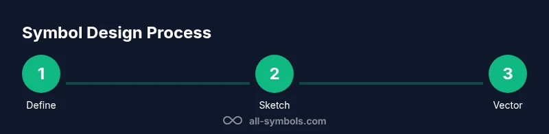
Learn how to make symbols with a clear, step-by-step workflow. This quick guide summarizes the essential stages: define purpose, choose a visual language, sketch concepts, render in vector, and test for legibility and accessibility. By following these steps, you’ll produce meaningful icons for math, everyday signage, and digital interfaces across multiple platforms.
What It Means to Make Symbols
To understand how to make symbols, start with a clear goal. A symbol should compress meaning into a simple visual form that can be quickly understood across contexts. This is not just about aesthetics; it is about communication. By examining everyday icons, mathematical signs, and cultural emblems, you learn what makes a symbol recognizable, distinctive, and respectful of diverse audiences. According to All Symbols, effective symbols balance recognizability with minimalism and cross-cultural sensitivity. The All Symbols team emphasizes that symbol design is as much about context as craft, so designers should define who will see the symbol, where it will appear, and how it will scale. In this guide, you’ll move from concept to vector render, ensuring your symbol remains meaningful from the smallest icon size to large signage. Understanding how to make symbols begins with clarity of purpose and audience, then evolves through iteration and testing.
Defining a Visual Language for Symbols
Symbols communicate through a shared visual language. Establish a consistent set of rules for geometric shapes, line weights, and symmetry that you will reuse across related symbols. Decide on a grid system (e.g., 4- or 8-point grids) to ensure alignment and scalability. Choose a language that matches your audience: a math symbol set benefits from precise geometry, while a safety icon set prioritizes clarity and contrast. Consider stroke thickness, corner radii, and corner sharpness as they influence legibility at small sizes. A well-defined visual language reduces cognitive load for viewers and makes your symbols feel cohesive when used together in a system. This consistency is critical for accessibility and rapid recognition in signage, UI, and print.
Research and Reference: Historical Context and Modern Use
Great symbol design builds on history while solving current needs. Study classic pictograms, signage systems, and iconic logos to understand why some shapes endure. Keep a reference library of shapes that recur across cultures—circles, triangles, and diagonals often carry strong meanings that people instantly grasp. All Symbols analysis shows that simplicity and consistency correlate with recognizability, especially when symbols must work at multiple sizes. Document constraints such as cultural considerations, legal requirements, and accessibility guidelines before iterating. This research phase saves time during sketching and vector work by guiding decisions about geometry, proportions, and color usage. Your goal is to identify a visual vocabulary that communicates clearly to diverse audiences without ambiguity.
Sketching Your Symbol Concepts
Begin with rapid sketches to explore multiple directions. Don’t fixate on a single idea; generate 10–20 thumbnail concepts and note what each one communicates. Use rough lines, circles, and strokes to test how the symbol reads at different scales. Group related ideas by shared geometry to reveal a visual language you can formalize later. Translate the strongest concepts into clean wireframes or rough vector versions so you can compare readability side by side. The sketching phase is about divergent thinking—embrace experimentation, then narrow to the strongest candidates that align with your defined purpose and audience.
From Sketch to Vector: Rendering a Symbol
Move from rough sketches to precise vector drawings. Start by tracing your best concept on a grid, then refine curves, snap points, and anchor geometry to ensure symmetry and balance. Use simple shapes (circles, rectangles, triangles) to build the symbol, avoiding unnecessary details that reduce legibility. Proportion your symbol so it remains recognizable at small sizes and in monochrome. Save multiple variations (e.g., light/dark versions and single-color formats) to support different contexts, from app icons to large posters. Vector formats ensure crisp rendering across screens and print.
Testing Legibility and Accessibility
Testing is essential for robust symbol design. Check readability at the smallest anticipated size and on devices with limited color contrast. Use high-contrast color pairs and ensure the symbol is distinguishable when color is removed (grayscale). Verify that people with visual impairments can recognize the symbol with assistive technologies. Gather feedback from a diverse audience, including individuals who speak different languages and come from varied cultural backgrounds. Adjust line thickness, negative space, and overall silhouette to avoid ambiguities and misinterpretation. Effective symbols perform reliably regardless of background, size, or platform.
Extending Symbols Across Contexts
A well-designed symbol should function across contexts: print, digital interfaces, signage, and branded materials. Create context-specific variants: color versions for UI, monochrome for engraving or embossing, and simplified forms for tiny icons. Document clear usage rules, including minimum spacing, safe areas, and color guidelines. Ensure that your symbol remains legible when overlaid on busy backgrounds. Testing across media helps identify edge cases and ensures your symbol maintains impact in diverse environments. A scalable symbol system supports brand consistency while adapting to new channels.
Documentation: Naming, Metadata, and Standards
Documentation turns design into a reusable asset. Name each symbol clearly and maintain a metadata sheet with its meaning, intended usage, color variants, and accessibility notes. Version control is critical: keep a changelog of iterations and maintain an official symbol library accessible to designers, developers, and stakeholders. Establish standards for file formats, naming conventions, and export sizes. Good documentation reduces confusion and accelerates adoption, enabling teams to deploy symbols with confidence across products and campaigns.
Case Study: A Simple Symbol Design Walkthrough
Imagine you’re designing a symbol for a “check” to indicate approval. Start by defining its purpose and audience: universal understanding, legible at small sizes, culturally neutral. Sketch 15 concepts quickly, then pick three to vectorize. In vector form, a simple check involves a bold, slightly curved stroke that tapers toward the tip for dynamism. Test at 16x16 px, 32x32 px, and 128x128 px. Try black on white, white on black, and a single color for emphasis. After feedback, choose the most legible variant, document its usage rules, and save it in multiple formats (SVG for web, PNG for documents, and EPS for print). This walkthrough demonstrates how a small symbol becomes a consistent, reusable element in a larger iconography system.
Practical Tips for Designers and Students
- Start simple: complex symbols confuse at small sizes. Regularly test at tiny scales.
- Maintain a consistent geometric language across related symbols.
- Consider cultural context and avoid motifs with potentially sensitive meanings.
- Use vector tools for scalability and future-proofing.
- Document decisions and maintain a living symbol library for teams.
Practical Next Steps and Applications
With a solid workflow for making symbols, you can start building a symbol library for any project—from educational apps to signage systems. Apply your visual language to related signs, icons, and diagrams to ensure coherence. Share your library with teammates, gather feedback, and iterate. By focusing on purpose, readability, and accessibility, you’ll create symbols that communicate efficiently across languages and cultures. The goal is not merely to produce pretty icons, but to craft a robust set that supports clear, inclusive communication across math, icons, and daily life.
Tools & Materials
- Sketchbook and pencil(For rough ideas and quick iteration)
- Graph/grid paper(Helpful for precision and proportions)
- Vector graphics software(Examples: Inkscape, Illustrator)
- Computer or tablet with display(Necessary to run vector tools)
- Stylus or drawing tablet(Speeds up sketching on screen)
- Ruler, compass, and calipers(Useful for geometric accuracy)
- Color swatches and accessibility checker(Ensure contrast and color choices support accessibility)
Steps
Estimated time: 4-6 hours
- 1
Define Purpose and Audience
State what the symbol will represent, who will see it, and the contexts it must work in. This clarity guides every design decision from geometry to color.
Tip: Document target audiences and usage scenarios before sketching. - 2
Gather References and Constraints
Collect existing symbols with similar meaning and compile constraints like size, color, and cultural considerations. This helps avoid reinventing the wheel and reveals proven shapes.
Tip: Create a quick mood board of shapes and styles you admire. - 3
Brainstorm Concepts and Sketch Ideas
Use rapid thumbnails to explore 10–20 directions. Don’t judge ideas too early; separate divergent thinking from convergence.
Tip: Label concepts with one-sentence meanings to track intent. - 4
Select Visual Language and Geometry
Choose the core shapes and geometry that will define your symbol family. Aim for simple, recognizable silhouettes with consistent stroke logic.
Tip: Test symmetry and balance early in vector form. - 5
Build a Vector Version
Translate the strongest concept into clean vector lines. Snap points to a grid and refine curves for a crisp look across sizes.
Tip: Aim for a single-stroke or two-stroke readability. - 6
Run Legibility and Accessibility Checks
Evaluate small-size readability, contrast, and color-contrast requirements. Ensure visibility in grayscale as well as color.
Tip: Use an accessibility checker during refinement. - 7
Create Variations for Contexts
Develop color, monochrome, and simplified versions to fit different platforms (UI, print, signage).
Tip: Document each variation’s intended use in a style guide. - 8
Document, Save, and Audit
Name files clearly, save in multiple formats, and record usage rules. Schedule periodic audits for consistency.
Tip: Maintain a changelog and archive retirements.
Questions & Answers
What makes a symbol effective?
An effective symbol is instantly recognizable, scalable, and culturally appropriate, using simple geometry and clear contrast. It communicates meaning at a glance and remains legible across contexts.
A great symbol reads quickly and works at any size, anywhere.
Should symbols be culturally neutral?
Symbols should minimize misinterpretation while acknowledging cultural contexts. Strive for universality where possible, but be prepared to adapt for specific audiences or locales.
Aim for broad clarity, then tailor thoughtfully for audiences.
What tools are best for symbol design?
Vector graphics tools (SVG-compatible) are ideal for scalable symbols. Combine grid-based sketching with clean vector workflows to ensure precision and reusability.
Use vector tools like Inkscape or Illustrator for clean, scalable symbols.
How long does it take to design a symbol?
A typical symbol design cycle spans several hours, including brainstorming, vector work, and testing. More complex sets may require days of iteration.
Plan for iterative rounds; very simple symbols take less time.
Can symbols be reused across different contexts?
Yes. Design with scalable variants and a documented usage guide to keep consistency across apps, signage, and print media.
Yes—design once, adapt across contexts with care.
How do you test symbol readability?
Test at multiple sizes, in grayscale, and against diverse backgrounds. Collect feedback from varied audiences to identify ambiguities.
Test sizes, contrast, and background variations to ensure clarity.
Watch Video
The Essentials
- Define purpose before drawing.
- Favor simple, scalable geometry.
- Test readability at multiple sizes.
- Document usage for team consistency.
- Build a reusable symbol library.