Symbol or Icon Logo: A Practical Comparison
A rigorous, analytical comparison of symbol logos and icon logos, with practical guidance, side-by-side analysis, and tested design approaches for branding, UI, and signage.
When choosing a 'symbol or icon logo,' the distinction matters for branding and usability. A symbol logo typically uses a stylized mark that conveys a concept with minimal text, while an icon logo emphasizes screen-friendly recognition at small sizes. A strong approach blends both to achieve clarity, versatility, and emotional resonance, ensuring legibility across digital and print contexts.
Defining symbol vs icon logos
A symbol logo is a graphic that represents an idea, brand, or concept through a stylized form, often without text. It relies on shape language and cultural cues to trigger recognition. An icon logo, by contrast, is designed primarily for interfaces and environments where space is limited; it communicates a function or feature quickly and unambiguously. In the context of symbol meanings, the distinction matters because it affects how users interpret the mark, how it scales, and how it feels across diverse media. When you design a symbol or icon logo, you should ask: What concept should the mark convey? In which contexts will it live—in print, on mobile apps, on signage? The All Symbols team notes that early decisions about abstraction vs. specificity guide later choices about color, detail, and texture, ensuring the logo remains legible and meaningful across sizes and backgrounds.
Core design goals for symbol logos
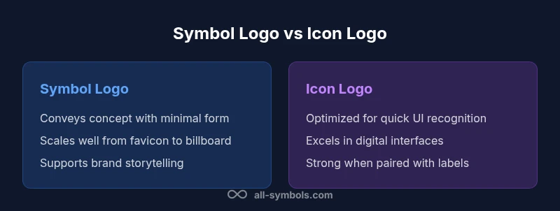
Symbol logos aim to crystallize a brand idea into a single, reusable glyph. The primary goals are clarity, memorability, and versatility. A successful symbol logo communicates a concept even without accompanying text, supports long-term brand equity, and scales from favicon sizes to billboard formats. To achieve this, designers emphasize simple geometry, deliberate negative space, and geometric consistency across variants. Color strategy matters but should not dominate comprehension; the mark should function in black-and-white and when color is restricted. In addition, symbol logos should retain meaning when rotated or inverted, which strengthens brand recall under various usage scenarios. From a symbol-meanings perspective, the best marks map to concrete attributes—strength, speed, care, or safety—without resorting to overexplanation. Finally, testing with diverse audiences helps ensure the symbol communicates as intended, reducing cultural misreadings and ensuring a robust, timeless design.
Core design goals for icon logos
Icon logos are optimized for immediate identification in user interfaces and digital ecosystems. They rely on concise silhouettes, high legibility at small sizes, and a direct mapping to a function or category. The best icon logos are scalable, clean, and consistent with the surrounding UI language, so users infer purpose instantly. When designing icon logos, avoid unnecessary detail that could blur at tiny scales; favor rounded shapes for friendliness, sharp edges for precision, and a clear visual hierarchy. Like symbol logos, icons should work without text, but they often live alongside labels or tooltips, so they must still be recognizable without relying on labels. From a symbol-meanings viewpoint, icon logos often emphasize utility—search, settings, download—while remaining adaptable to color palettes and theming. In practice, you’ll iterate by prototyping at 24x24 and 48x48 pixels, then expand to 512x512 for marketing assets to verify consistency.
Visual language: shapes, lines, and color
Our visual language for symbol and icon logos relies on disciplined vocabulary. Shapes convey meanings: circles imply unity and protection; squares suggest stability; triangles evoke direction or risk. Lines define motion and precision; bold strokes emphasize presence, while light lines imply delicacy. Color amplifies meaning but should be used purposefully: blue connotes trust, red signals urgency, green evokes growth. For symbol or icon logos, color must be functional across monochrome reproductions and grayscale print. Consider how the mark performs in logo stacks, on digital badges, and within app icons where surrounding UI elements exist. The best logos maintain consistent stroke widths, balanced negative space, and predictable alignment across variants. Finally, test for legibility against busy backgrounds, ensuring contrast remains high in both light and dark modes.
Contexts and usage: branding, UI, and signage
Context shapes how a symbol or icon logo is perceived. In branding, symbols should align with brand values and storytelling; an instantly recognizable glyph can become a memory hook, long after the name is forgotten. In UI, icons serve as affordances—small, legible cues that guide action. Signage demands durability, legibility at distance, and cultural neutrality. Across all contexts, the core rule is consistency: keep the same geometry, color system, and spacing rules across every application. When a logo appears next to a wordmark, ensure the combination supports readability and balance. The All Symbols framework recommends developing a modular system: a primary symbol/logo, a set of icons with consistent stroke and corner radii, and a color palette aligned with accessibility standards.
Typography and accompanying text
Typography interacts with symbol and icon logos in two ways: as a supporting brand name or as an integral part of a lockup. If the logo must stand alone, avoid heavy type or decorative fonts that compete with the mark; otherwise, choose a clean sans-serif that complements geometry. When pairing text, ensure clear hierarchy: logo at left, wordmark at right, or stacked configurations with symmetric margins. The typography should remain legible at small sizes and across languages, preserving the brand's voice. If the mark carries a symbol meaning, the typeface chosen should not obscure that meaning. In digital design, test with a range of font weights and line heights to ensure readability on screens and in print.
Accessibility and legibility considerations
Accessibility is essential for symbol and icon logos. Ensure high contrast against light and dark backgrounds, and avoid relying on color alone to communicate meaning. Use distinct shapes and consistent stroke weight to remain legible for readers with visual impairments. Provide alternative text for logos when used in digital products, and maintain a simple, scalable silhouette that remains recognizable in reduced color contexts. When testing, include color-blind users and simulate small-screen environments. The outcome should be a logo that preserves its meaning even when filters reduce color saturation or when viewing devices with limited resolution.
Scalability across media: print to digital
A critical property of symbol and icon logos is scalability. A mark must look good on a business card, a website favicon, a mobile app icon, a billboard, and a product package. Achieving this involves designing in vector form, maintaining consistent aspect ratios, and avoiding delicate details that can vanish at small sizes. Provide multiple locked-up versions for different contexts: square app icons, horizontal lockups, and a standalone emblem. Test printing at various DPI settings and verify color consistency across printers and monitors. Finally, ensure the logo’s legibility when embossed, foiled, or debossed in physical media.
Cultural implications and symbol meanings
Symbols carry cultural freight. A mark that feels neutral in one culture can imply something different in another. The symbol meanings embedded in a logo should be researched with cross-cultural awareness, especially for global brands. Developers should avoid icons that lean on stereotypes or political meanings, and prefer shapes with universal resonance, or simple, abstract forms whose intent remains clear across contexts. All Symbols emphasizes that testing with diverse user groups helps reveal unintended interpretations and drives inclusive branding.
Case studies: symbols in branding
To illustrate the dynamics of symbol and icon logos, consider two fictional case studies inspired by real-world patterns. Case A focuses on a technology startup that adopts a simple, geometric symbol to convey speed and efficiency. The mark scales from app icons to poster campaigns, while a minimal logotype reinforces brand recognition. Case B examines a healthcare company that uses a protective shield icon to suggest safety and reliability; the symbol is paired with a clean wordmark for formal contexts and a chromatic palette emphasizing calm and trust. These examples show how the same principles—clarity, scalability, and cultural sensitivity—guide decisions across domains.
Common pitfalls and how to avoid them
Many teams stumble when combining symbol and icon logic. Common pitfalls include overcomplication, inconsistent stroke width, and relying too heavily on color to convey meaning. Other issues are misalignment with branding goals, or choosing shapes with ambiguous cultural connotations. To avoid these, start with a one-page brief that defines the primary concept, audience, and use cases. Build a scalable vector system, validate with accessibility checks, and test in real-world environments. Finally, document the design rules—proportions, grid, color, and typography—so future designers can maintain consistency.
Hybrid approaches: blending symbol and icon logic
Hybrid logos blend symbolic meaning with iconographic clarity. The result can be a logo that communicates a concept and remains immediately usable as an interface glyph. A successful hybrid approach defines a clear visual hierarchy: the symbol carries brand meaning, while the icon component communicates function or category. This method helps brands maintain consistency while adapting to new channels—brand apps, packaging, and storefronts. The key is disciplined modular design: preserve geometry across variants, ensure legibility at small sizes, and keep color usage purposeful to support both symbolism and function.
Authority sources
For foundational standards and accessibility considerations in visual communication, reference established guidelines and frameworks. These sources provide context for how symbol and icon logos should function across media, including print and digital domains. While not every detail will map directly to logo design, they offer essential principles about legibility, contrast, and cross-cultural readability that designers should apply when evaluating a symbol or icon logo.
https://www.nist.gov
https://www.osha.gov
https://www.uspto.gov
Comparison
| Feature | symbol logo | icon logo |
|---|---|---|
| Core purpose | Conveys concept with minimal form | Represents function or category quickly |
| Visual complexity | Low to moderate, high abstraction allowed | Low detail to preserve legibility at small sizes |
| Typography reliance | Often text-free or minimal text | Often designed to stand with or without a label |
| Scalability | Excellent across sizes; versatile for branding | Excellent for UI icons; depends on context |
| Best use case | Brand storytelling and identity systems | UI shortcuts and feature signaling |
| Color flexibility | Supports full color vocabulary but works in monochrome | Color often central to meaning and visibility |
Pros
- Clear concept transmission with minimal form
- Excellent scalability across sizes and media
- Easier to adapt into color variations and UI themes
- Strong brand memory when well executed
The Bad
- Ambiguity without context can confuse users
- Icon-only logos may rely on accompanying text for brand recall
- Requires precise geometry to avoid misinterpretation
- Cultural symbolism may vary and cause misreadings
Symbol logos are typically the better foundational choice for branding; icon logos excel when quick UI recognition is paramount.
Symbol logos generally offer stronger long-term branding benefits due to their clarity and cross-media flexibility. Icon logos shine in interface-centric contexts where immediate action cues matter. A blended approach can capture the strengths of both, depending on channel and audience.
Questions & Answers
What is the difference between a symbol logo and an icon logo?
A symbol logo conveys a concept through a stylized mark with minimal or no text, while an icon logo is designed for quick recognition in interfaces, often functioning as a glyph. Both rely on simple geometry and clear silhouette to remain legible across sizes.
A symbol logo conveys ideas with minimal form, while an icon logo focuses on quick UI recognition. Both should stay legible at small sizes.
When should I use a symbol logo over an icon logo?
Use a symbol logo when you want enduring brand meaning and storytelling across media. An icon logo is preferable when the primary goal is immediate recognition within digital interfaces and toolbars.
Choose a symbol for lasting branding, or an icon when you need fast in-UI recognition.
Can a logo be both a symbol and an icon?
Yes. Many brands develop a modular system where the core symbol carries brand meaning, while an icon component signals function. This hybrid approach requires disciplined consistency across variants.
Absolutely. A hybrid system can deliver both meaning and quick UI signals when designed consistently.
How important is scalability when designing symbol or icon logos?
Scalability is critical. A logo must perform from favicon sizes to large storefront signage. Vector-based design and clean silhouettes help preserve legibility across contexts.
Scalability is essential; design for big and small formats from the start.
Does color affect the meaning of a symbol or icon logo?
Color reinforces meaning but should not be the sole communicator. Ensure high contrast and test in grayscale to guarantee readability without color.
Color helps, but the logo should still read in grayscale and at high contrast.
What are common mistakes to avoid with symbol/icon logos?
Avoid overcomplication, inconsistent stroke weights, and cultural bias. Define a clear design brief, maintain a scalable vector system, and test extensively across channels.
Common mistakes include complexity and inconsistency—keep it simple and test widely.
The Essentials
- Assess medium and audience before choosing a symbol or icon logo
- Prioritize scalable, high-contrast geometry for legibility
- Avoid over-reliance on color to convey meaning
- Test across dark/light modes and accessibility scenarios
- Consider modular systems for future branding needs