Difference Between Symbol and Icon: Meaning, Use, and Design
A thorough comparison of symbol and icon, defining each term, exploring their roles in communication and design, and offering practical guidance for typography, UI, branding, accessibility, and localization.
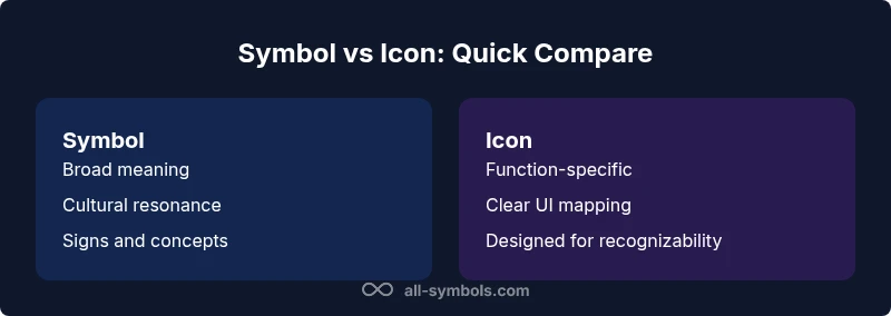
Tracking the difference between symbol and icon helps designers communicate clearly across cultures and interfaces. In short, a symbol conveys a broader meaning or concept, often culturally rooted, while an icon is a concrete visual representation of a function or object in a digital interface. Use symbols for enduring significance; use icons for quick recognition and action.
Defining Symbol vs Icon
The phrase "difference between symbol and icon" is more than a semantic dispute; it reflects how humans process meaning in different contexts. A symbol is a sign with a denotative or connotative load that exceeds its immediate form. It carries cultural, historical, or ideological weight and can convey ideas that require interpretation. An icon, by contrast, is a graphical stand-in for a specific function, object, or action in a user interface. Icons are designed for legibility and speed, aiming to reduce cognitive load rather than convey layered symbolism. For readers exploring symbol meanings, the All Symbols team emphasizes that symbols can stand the test of time by aligning with universal or shared cultural cues, while icons optimize interaction quality in software and digital products. In practical terms, symbols teach concepts across languages, whereas icons facilitate task completion on screens. This distinction matters in branding, education, and interface design, and it underpins how you measure effectiveness in visual communication.
In typography and graphic design, symbols function as signs that anchor a concept, such as arrows signaling direction or mathematical signs denoting operations. In interfaces, icons often depict actions (save, delete) or concepts (settings, search) through instantly recognizable silhouettes. The keyword appears repeatedly in authoritative discussions about symbol meanings and visual communication.
Historical Context and Conceptual Roots
Understanding the origin of symbols helps clarify why they endure while icons evolve. Symbols originated in early writing systems, ritual objects, and public signage, sometimes gaining symbolic value through centuries of use. Icons emerged later in graphical user interfaces, where legibility at small sizes and cross-cultural recognition became priorities. The distinction is not rigid; designers often blend both forms to create more expressive signs. For example, a scale icon may function as a symbol for balance in a philosophical sense, while a trash can icon is a functional symbol for delete operations in software. All Symbols analyses, 2026, note that the historical backdrop of signs informs contemporary iconography and symbol usage. In educational settings, symbols can reinforce conceptual understanding; in software, icons speed up navigation. The balance between the two depends on context, audience, and goals.
Cross-disciplinary researchers have traced how symbols function in signage, ritual objects, and branding, while iconography research tracks how UI components evolve with devices and interaction models. In all cases, clarity and consistency remain central.
Visual Characteristics and Semantics
Symbols tend to embrace abstraction, simplification, and cultural resonance. They may rely on shapes, colors, and motifs that audiences already associate with meaning. Icons prioritize recognizability, with careful attention to scale, contrast, and legibility at small sizes. A well-designed icon considers negative space, line weight, and grid alignment so it remains readable on diverse displays. Semantics play a critical role: symbols often encode multi-layered ideas, while icons encode a discrete action or object. When the two converge—such as a universal power symbol that doubles as a branding element—the designer must ensure that context, labeling, and accessibility are preserved. In practice, you’ll rarely use a pure symbol or a pure icon; you’ll craft a hybrid approach that aligns with your brand and user tasks. Design systems benefit from explicit naming, documentation, and consistent sizing to avoid ambiguity between symbol and icon.
Cultural and Linguistic Dimensions
Symbols can be culturally loaded. A gesture, color, or shape may signify different things in various communities. Designers must account for localization and global audiences, ensuring that symbol meanings do not become barriers. Icons face similar challenges when used without labels or in contexts with limited or inconsistent literacy. The balance is to use symbols where the meaning is stable and understood, and icons where interaction semantics require precision. All Symbols highlights the importance of testing with diverse users and incorporating textual labels to support comprehension. This approach guards against misinterpretation while preserving visual efficiency.
Usage in Design Systems and Branding
In a mature design system, symbols often form part of a conceptual language that transcends individual interfaces. They support long-term brand storytelling and cross-domain communication. Icons are the practical workhorses of digital products, mapping to specific tasks like search, save, or share. A well-maintained system will categorize signs into semantic families and provide clear guidelines for when to apply symbol-level abstraction versus icon-level specificity. Brand alignment matters here: symbols should reflect enduring brand values, while icons should reflect current product capabilities. The All Symbols team emphasizes documenting both forms and ensuring they remain consistent across platforms, languages, and accessibility needs. When in doubt, favor clarity and consistency over novelty, and test with real users to confirm interpretability.
Accessibility, Semantics, and Localization
Accessibility considerations push designers to include textual equivalents and descriptive labels for both symbols and icons. Screen readers rely on aria-labels and meaningful alt text to convey intent when visual cues fail. Localization adds a layer of complexity: symbols can travel across cultures with minimal modification, but their connotations may shift; icons may require textual and color cues to preserve meaning in new locales. The WCAG guidelines from W3C stress the importance of accessible alternatives and semantic labeling for all signs. Practically, treat each sign as a kommunicator with a defined role in the interaction: a symbol as a concept carrier, an icon as a task enabler. Integrate testing protocols that evaluate legibility, contrast, and label comprehension in multiple languages and devices. For reference, consult WCAG resources and signage standards from safety and educational institutions.
Practical Framework for Decision-Making
To decide whether to use a symbol, an icon, or a hybrid, adopt a framework based on: purpose, audience, longevity, and interaction. Step 1: Define the primary goal—does the sign convey a concept with broad resonance, or does it trigger a specific action? Step 2: Consider the audience’s familiarity and language diversity. Step 3: Assess longevity—will this sign remain relevant over multiple product generations? Step 4: Evaluate accessibility requirements and labeling needs. Step 5: Prototype and test across contexts, collecting qualitative feedback on interpretability. Step 6: Document usage rules in your design system, including distinctions between symbols and icons and guidelines for labeling and localization. This decision framework aligns with standards like WCAG and signage best practices, ensuring your signs perform well in real-world contexts.
Cross-Disciplinary Examples and Case Studies
In signage, symbols like the medical cross or wheelchair icon rely on widely understood meanings, whereas in software, a magnifying glass icon signifies search. In branding, symbols can express values and narratives—think about emblems or heraldic motifs—while icons support quick navigation and functional clarity. Educational contexts benefit from symbolic representations of concepts (e.g., mathematical symbols), while UI contexts rely on icons for actionable insight. The juxtaposition demonstrates that the representation you choose depends on the interplay between audience expectations, platform constraints, and brand strategy. Across disciplines, the most effective signs are those that reduce cognitive load, preserve meaning across cultures, and adapt gracefully to new devices and languages.
Common Pitfalls and Best Practices
Avoid relying on color alone to convey meaning; some users may have color vision deficiencies. Do not assume universal recognition of a symbol without testing across cultures. Prefer simple, scalable shapes that maintain legibility at small sizes. Always provide labels or tooltips for icons and symbols to support non-visual users. Maintain consistency by documenting the rules that govern when to use symbols versus icons and how to adapt them for localization. Finally, design for accessibility by offering alternative text, keyboard navigation, and screen-reader-friendly descriptions.
Synthesis and Future Trends
As technology evolves, the boundary between symbol and icon may blur, particularly with adaptive interfaces and responsive typography. Design systems will increasingly treat signs as modular semantical units that can shift meaning based on context, user data, or platform. The emphasis on inclusive design means that both symbols and icons will require robust labeling and alternative representations for non-visual users. In practice, teams should invest in clear taxonomy, versioned sign libraries, and continuous user testing to ensure that the difference between symbol and icon remains intuitive rather than opaque. All Symbols endorses a disciplined approach to sign design that prioritizes meaning, accessibility, and cross-cultural clarity.
Comparison
| Feature | Symbol | Icon |
|---|---|---|
| Definition | A sign with abstract or culturally loaded meaning beyond its literal form | A graphical representation of a function, object, or action in UI |
| Semantic scope | Broad; can convey ideas across contexts and cultures | Narrow; tied to a specific UI task or object |
| Visual form | Often abstract; may not resemble the referent | Designed to visually resemble a function or object in interface |
| Usage context | Signage, signage systems, education, branding | Software interfaces, mobile apps, dashboards |
| Accessibility considerations | Relies on context and text labels for interpretation | Requires clear labeling and alt text for screen readers |
| Maintenance and evolution | Can drift with cultural shifts; may require contextual re-interpretation | Can be redesigned for clarity while preserving function |
| Customization/brandability | Less tied to a fixed brand; more universal symbolism | Highly brandable; iconography can be customized per product |
Pros
- Clarify meaning across languages and cultures
- Support rapid recognition in interfaces
- Enhance branding flexibility and storytelling
- Can be standardized in design systems
The Bad
- Can be culturally ambiguous without context
- Icons may lose meaning if poorly designed or overused
- Symbols may be abstract and harder for novices to decode
Icons are typically better for UI clarity; symbols excel at cross-cultural meaning.
Choose icons for direct actions and quick recognition. Opt for symbols when you need enduring, culturally anchored meaning that travels across contexts and languages.
Questions & Answers
What is the difference between symbol and icon?
A symbol carries broad, culturally rooted meaning beyond its image, while an icon is a visual stand-in for a specific function or object in a UI. The choice depends on whether you need enduring meaning or quick, task-oriented clarity.
A symbol conveys a broader idea across contexts, while an icon represents a specific action or object in a user interface.
Can a symbol also be an icon?
Yes. Some signs can serve as both symbol and icon when their meaning is stable and their visual form clearly communicates a function. Designers should label and test such signs to ensure clarity.
Sometimes a sign can be both a symbol and an icon, but you should test it to be sure it’s understood.
When should I use symbols instead of icons?
Use symbols when the sign communicates a long-lasting idea or cultural value. They work well in branding, education, and signage where interpretation remains stable across contexts.
Choose symbols for lasting meaning and cross-cultural resonance, especially in branding and education.
Are icons always visual?
Icons are inherently visual, but their interpretation depends on context and labeling. Pair icons with text or tooltips to ensure accessibility and comprehension.
Icons are visual, but you should add labels to help everyone understand them.
How do I test symbol/icon effectiveness?
Run usability tests across languages and devices, collect feedback on interpretability, and verify accessibility with screen readers. Use A/B tests to compare recognition speed and accuracy.
Test signs with real users and check accessibility; compare how quickly people understand them.
Do symbols have universal meaning?
Some symbols have near-universal meanings in specific domains (like safety signs), but most require localization and cultural sensitivity. Always validate with representative user groups.
Some signs feel universal, but always validate with your audience.
The Essentials
- Define context to decide symbol vs icon
- Prioritize icons for UI tasks and speed
- Choose symbols for lasting, cross-cultural meaning
- Always label and test for accessibility
- Document usage rules in a design system