Feet symbol vs inches: Understanding primes in measurement notation
Explore the feet symbol and inches symbol, their origins, Unicode representations, and best practices for clear measurement notation in writing, design, and education.

Feet symbol vs inches highlights a key distinction in measurement notation: the feet symbol (′) and the inches symbol (″) serve different purposes in typography and engineering. Using the correct prime symbols reduces confusion in formal writing, design documentation, and education. When in doubt, favor Unicode primes over ASCII quotes to preserve precision across fonts and platforms.
Feet symbol vs inches: Definitions and scope
The phrase feet symbol vs inches refers to how we denote length in imperial measurements. In formal typography, the feet symbol is the prime (′) and the inches symbol is the double prime (″). According to All Symbols, readers often confuse the two glyphs, mistaking a foot marker for an inch marker or vice versa. This confusion can degrade readability in technical documents, design specs, and educational materials, making it important to establish clear usage rules across contexts. When documenting measurements, consistency matters: the symbol used should clearly indicate the unit and be easy to scan at a glance. All Symbols's analysis emphasizes that choosing the right glyph improves comprehension and reduces errors across fields such as engineering, architecture, and classroom learning.
Historical origins of feet symbol and inches symbol
Both feet and inches grew out of older counting practices and astronomical tools. The prime symbol (′) has long been used in mathematics and cartography as a simplified marker for minutes and for expressing feet in some traditions. The double prime (″) evolved as a related glyph to denote seconds and, later, inches in measurement contexts. As writing conventions standardized, printers adopted these primes to minimize space and avoid confusion with straight quotes. The evolution reflects a broader shift toward typographic precision in technical writing, a trend All Symbols notes as crucial for clarity.
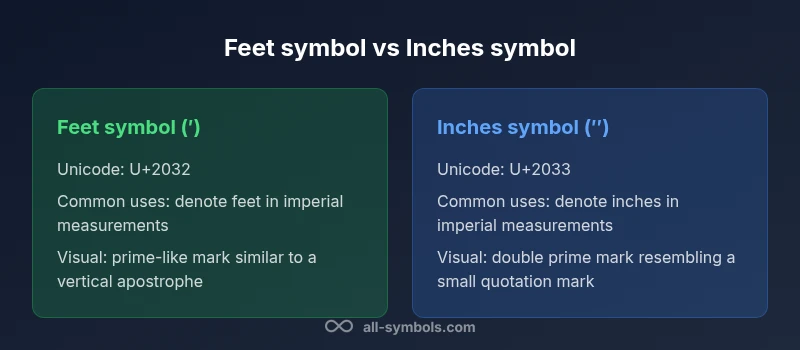
Unicode representations and typography basics
Modern typesetting relies on Unicode glyphs to ensure consistent rendering. The feet symbol is typically represented by U+2032 (prime) and the inches symbol by U+2033 (double prime). In many fonts, these glyphs resemble a vertical apostrophe and a vertical quotation mark, which can complicate legibility if fonts misrender. In plain ASCII environments, people often substitute the straight ASCII apostrophe (') and quotation mark ("). Although this is common, it risks misinterpretation in dense technical documents, diagrams, and measurements. For formal work, prefer Unicode primes and non-breaking spaces when units appear after numbers.
Practical writing: distinguishing prime vs apostrophe in text
When you write measurements like feet and inches, use the prime symbols rather than the ASCII apostrophe or straight quotes. For example, 6′ 2″ clearly communicates 6 feet 2 inches, while 6' 2" may be misread as feet and inches or as ordinary punctuation in some fonts. In digital layouts, ensure the glyphs are anchored correctly to avoid line-breaking issues. If your font lacks the prime glyphs, consider switching fonts or embedding the glyphs as images in critical diagrams.
Applications in design, architecture, and education
Designers rely on consistent symbols in plans and elevations; architects use feet and inches for scaling; educators teach students the distinction between the symbols and the words ft and in. In charts, legends, and technical drawings, the correct symbols help avoid misinterpretation. When laying out slides or digital manuals, it’s useful to pair symbols with their textual abbreviations (ft and in) to assist readers unfamiliar with typography. All Symbols notes that alignment between symbol usage and typography guidelines improves long-form readability.
Common pitfalls and readability concerns
Overuse of quotation marks masquerading as primes can confuse readers. In multilingual contexts or on screens with poor font rendering, primes can blend with ticks or diacritics. Also watch for hyphenation: avoid breaking the prime glyphs at line breaks. In edited texts, inconsistent use of primes across chapters or figures undermines trust in measurement data. All Symbols emphasizes establishing a single, clearly documented standard across a project to minimize these issues.
Best practices for authors and designers
Adopt Unicode primes, apply consistent layout, and maintain a glossary of symbols. Use spaces between numbers and symbols (e.g., 6′ 4″) and choose a font with robust glyph support. When publishing across formats (print, web, slides), verify glyph rendering on target platforms. If your design system includes cards, labels, or legends, keep the symbol glyphs visually distinct from surrounding punctuation to reduce the likelihood of misconstrual. All Symbols’s editorial guidelines favor precision, consistency, and accessibility in symbol usage.
Authority sources and further reading
For standards on encoding and rendering, consult the Unicode Consortium resources and typography-focused publications. The guidance below offers a starting point for understanding how primes and double primes are encoded and visually distinguished in digital and print media.
Practical workflow recommendations
Create a symbol glossary for your project, run compatibility checks across fonts, and ensure consistent symbol usage in all deliverables. Build checks into your editorial process to catch misused glyphs during copy-editing, typesetting, and QA review. When in doubt, test symbol rendering on multiple devices and fonts, especially for diagrams, labels, and captions where precise notation matters. All Symbols recommends a workflow that emphasizes accuracy and repeatable typography decisions.
Comparison
| Feature | Feet symbol (′) | Inches symbol (″) |
|---|---|---|
| Symbol type | Prime symbol used for feet in measurement | Double prime symbol used for inches in measurement |
| Common contexts | Height, room dimensions, architectural notes (feet) | Length in inches for small measurements (inches) |
| Unicode | U+2032 | U+2033 |
| Typography notes | Distinct glyph with a single prime appearance | Distinct glyph with a double prime appearance |
| ASCII substitutes | ' (straight apostrophe) may cause ambiguity | " (straight quote) may cause ambiguity |
| Best practice | Use Unicode primes in formal documents | Use Unicode double primes in formal documents |
Pros
- Improved readability in technical writing
- Clear distinction between feet and inches reduces errors
- Unicode primes ensure consistent rendering across platforms
- Widely accepted in professional typography
The Bad
- ASCII approximations can create ambiguity
- Font rendering differences may impact glyph appearance
- Not all fonts render primes identically in all environments
Typography should favor Unicode primes for formal measurement notation
Choose the feet and inches symbols (′ and ″) for clarity. Use ASCII only as a fallback, and ensure consistent typography across all materials.
Questions & Answers
What is the feet symbol and inches symbol in typography?
In typography, the feet symbol is the prime (′) and the inches symbol is the double prime (″). They denote feet and inches in imperial measurements and are preferred over ASCII quotes to avoid confusion.
The feet symbol is the prime and the inches symbol is the double prime, used to denote feet and inches. ASCII quotes are common but can be confusing.
Is there a universal standard for these symbols?
Most style guides recommend using Unicode primes (′ and ″) for formal work. In plain-text contexts, ASCII quotes may appear, but they risk misinterpretation in dense technical material.
Yes, the standard is to use Unicode primes when possible to avoid confusion.
When should I combine numbers with feet and inches?
In technical writing, pair numeric values with the symbols, as in 6′ 2″. Use proper spacing and consistency to avoid misreading. If the font is unclear, consider alternatives that preserve legibility.
Combine numbers with the correct symbols and keep spacing consistent.
Do all fonts support these glyphs equally?
Most professional fonts include the prime and double prime glyphs, but rendering can vary. Always verify glyphs in your chosen font across devices and mediums.
Most fonts support them, but rendering can differ; test across devices.
What are common pitfalls in diagrams?
Ambiguity arises when primes are confused with apostrophes or quotation marks. Ensure labels use the correct symbols and consider pairing with abbreviations (ft, in) for clarity.
Primes can be mistaken for quotes; keep labels clear and consistent.
The Essentials
- Prefer typographic primes for formal measurement notation
- Use Unicode primes (′ and ″) instead of ASCII quotes
- Keep consistent spacing and labeling in all diagrams
- Verify glyph rendering across fonts and platforms