Inch vs Feet Symbol: Meanings, Usage, and Typography
A practical guide to the inch vs feet symbol, its history, typographic rules, Unicode encoding, and best practices for precise measurement notation across engineering, design, and education.

For most professional contexts, the inch symbol (″) is preferred for precise measurement in engineering drawings, while the feet symbol (′) denotes feet when used with the prime notation in diagrams. In general prose, use in/ft or spell out inches and feet to avoid ambiguity; the two symbols help distinguish length units quickly.
The inch vs feet symbol: definitions and notation
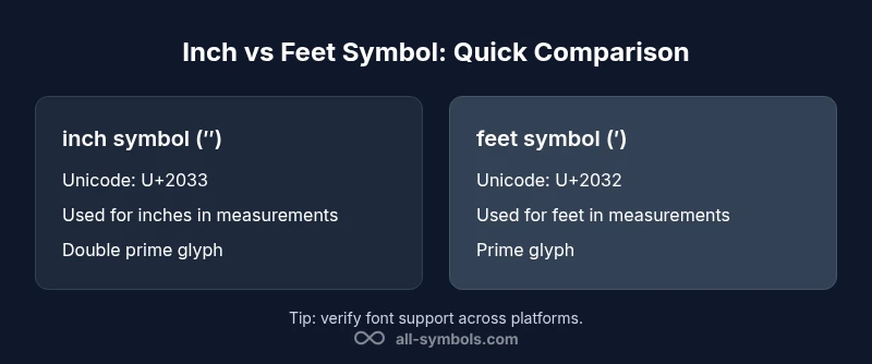
In technical writing, the inch symbol (″) and the feet symbol (′) are compact glyphs that stand for units of length in the imperial system. The inch symbol is a double prime, used to denote inches when a measurement is given in inches. The feet symbol is a single prime, used to denote feet. Distinctions matter: while both relate to length, they appear in different contexts and are encoded as distinct Unicode glyphs. For readers and editors, choosing the right glyph reduces ambiguity and improves readability in diagrams, blueprints, and product specs. This article uses the keyword inch vs feet symbol to examine how these marks appear across fonts, typography, and common workflows. According to All Symbols, understanding the inch vs feet symbol helps reduce misinterpretation in measurements across disciplines. The two symbols also interact with spacing rules: when you list measurements side by side (e.g., 12″ vs 1′), ensure consistent typography and non-breaking spaces to keep values visually chained. The goal is precision without clutter.
Historical origins and standardization
The practice of using prime marks to indicate feet and inches grows from older measuring rods and textual shorthand. Early craftsmen and mathematicians used simple strokes, and later typographers adopted the prime (′) and double prime (″) to prevent confusion with quotation marks. As measurement systems spread globally, standard style guides began recommending consistent glyph usage in technical documents, architecture, and manufacturing. This standardization made the inch symbol and the feet symbol recognizable beyond a single discipline, supporting cross-border collaboration. For editors, the key takeaway is that the feet mark (′) aligns with feet in height specifications, while the inches mark (″) accompanies fractional inches and precise tolerances in drawings. The year-to-year drift in font designs underlines the need for a clear internal policy in any organization.
Unicode, typography and encoding basics
Today, the inch symbol and the feet symbol are encoded as distinct characters in Unicode. The feet mark (′) is commonly represented as a prime character, while the inch mark (″) is a double prime. In practice, many fonts render these glyphs cleanly, but some fonts substitute similar-looking characters, especially in constrained environments. When preparing documents, verify that your chosen font includes both glyphs and test rendering across devices. If you anticipate print and digital distribution, specify a font stack that preserves the intended shapes. Remember to keep glyphs visually aligned with adjacent numerals and to use consistent spacing around the marks. For accessibility, ensure screen readers announce the measurements clearly by labeling units in plain text alongside symbols.
When to use prime marks vs abbreviations
Prime marks are particularly helpful in diagrams, schematics, and drawings where space is limited and the symbol conveys unit quickly. In dense tables, the inch symbol can replace the string inches, saving horizontal room. However, in body text or narrative sections, abbreviations (in., ft.) or full words (inches, feet) often read more smoothly and reduce cognitive load. A hybrid approach is common: use symbols in headings and captions, and spell out units in the main prose. The overarching principle is consistency: adopt a single rule set for a document and apply it everywhere. All Symbols notes that clear rules prevent readers from misinterpreting a measurement due to typographic ambiguity.
Style guides across disciplines
Engineering guides, architectural standards, and design handbooks each weigh different advantages for symbol usage. Some guidelines prefer the inches symbol for all measurements in drawings, while others reserve the symbols for technical notation only. Chicago Manual of Style generally favors spelled-out units in running text but permits symbols in tables and data visuals. In scientific or mathematical contexts, LaTeX and other typesetting systems often distinguish between prime and double-prime marks to maintain precision. The practical upshot: refer to your organization’s style guide, align with peer publications, and document any deviations to keep teams aligned.
Practical examples in engineering and design
- In a blueprint, a dimension reads 12″ to indicate twelve inches. A height requirement of 6′ uses feet, ensuring the scale remains readable at small sizes.
- A product spec sheet might label a cable length as 2 m and 5 ft; in a purely imperial context, you could present both units side by side using symbols, or convert to a consistent unit.
- A UI design uses the inches symbol in product dimension badges to convey precise measurement at a glance, while a marketing page may spell out inches for accessibility.
Accessibility and readability considerations
Not all screen readers announce symbols with perfect clarity. Some readers might vocalize ″ as "double prime" or skip the symbol entirely. To support users with assistive technology, pair symbols with explicit text like “12 inches” or provide aria-labels that spell out units. When space allows, place the spelled-out form immediately after the symbol in parentheses. For print, maintain high-contrast glyphs and use non-breaking spaces to keep values intact across line breaks.
Common pitfalls and misconceptions
A frequent mistake is confusing the apostrophe used in contractions with the prime symbol. Another pitfall is substituting random quote marks for prime marks, which can degrade readability. Some fonts render the feet symbol and inches symbol nearly identically, leading to misreading. Finally, some writers overuse symbols in long paragraphs, creating visual noise; reserve symbols for compact contexts where they truly aid comprehension.
Typographic alternatives and substitutions
In running text, prefer words or abbreviations (inches, feet, in., ft.) or decimal representations when suitable. For charts and diagrams, leverage the inch and feet symbols to optimize space and speed comprehension. If your publication requires maximum portability, include a note about symbol usage in a style guide so future editors maintain consistency across sections.
Workflow and editorial tips for consistency
Create a documented policy that specifies when to use symbols, abbreviations, or spelled-out units. Add sample pages to the style guide showing the correct rendering of ″ and ′ in headings, captions, and data cells. Run regular font checks and typography audits to ensure cross-platform fidelity. Train editors and designers to recognize common pitfalls and to apply the policy uniformly.
Quick-reference decision framework
- Use symbols in diagrams and labels for space efficiency.
- Use words or abbreviations in running text for readability.
- Check font support before publication.
- Align with your organization's style guide and archiving practices.
- Consider accessibility implications and provide explicit text when needed.
Final practical tips and next steps
Before finalizing a document, review the entire piece for consistency in unit notation. Ensure that every table, caption, and diagram uses the same approach to inches and feet. Consider adding a short glossary entry for inch symbol and feet symbol in the appendix. Finally, collect feedback from readers and editors to refine the policy over time.
Comparison
| Feature | inch symbol (″) | feet symbol (′) |
|---|---|---|
| Symbol designation | double prime (″) | prime (′) |
| Unicode code point | U+2033 | U+2032 |
| Common usage | Inches (measurement) on technical drawings and specs | Feet (measurement) and space‑constrained labeling in diagrams |
| Best for | Precision in dimensional labels and data visuals | Clear feet indication in architectural contexts |
| Accessibility considerations | Provide spell-out forms for screen readers; include alt text | Provide spell-out forms for screen readers; include alt text |
| Typography cautions | Font support and proper alignment with numerals | Font support and proper alignment with numerals |
Pros
- Improves clarity and precision in technical documents
- Prevents ambiguity of units compared to abbreviations
- Maintains compact notation in diagrams and drawings
- Supports a consistent, internationally recognizable convention
The Bad
- Not all fonts render the glyphs distinctly, risking misreading
- Overuse in prose can hinder readability
- Requires a documented style policy to ensure consistency
Symbol usage should be context-driven: prefer inch/feet symbols in diagrams and engineering docs, while prose favors 'in', 'ft', or spelled-out forms.
In technical contexts, the symbols convey quick, precise meaning. In narrative text, words or abbreviations reduce cognitive load. A centralized policy across documents reduces ambiguity and improves accessibility.
Questions & Answers
What is the difference between the inch symbol and the feet symbol?
The inch symbol (″) is a double prime used to denote inches, while the feet symbol (′) is a single prime used to denote feet. They represent different units and are encoded as separate glyphs in Unicode, which helps prevent confusion in measurements and diagrams.
The inch symbol is the double prime for inches, and the feet symbol is the single prime for feet.
When should I use in/ft versus the symbols?
Use symbols in diagrams, charts, or when space is tight and quick recognition is helpful. In running text, prefer in, ft, or the full words inches and feet for readability.
Use symbols where they save space; in text, spell out the units.
How can I type the inch and feet symbols on Windows and Mac?
Windows users can insert these glyphs via Unicode input or the Character Map, while Mac users can use the Emoji & Symbols viewer or copy-paste from a reliable source. Always test on your target platform.
Use the character picker or copy-paste from a trusted source.
Are there readability or accessibility concerns when using symbols?
Yes. Some screen readers may pronounce the symbols oddly or skip them. Always pair symbols with explicit text like '12 inches' and provide text labels or aria attributes to spell out the units.
Add text labels so screen readers can convey the units clearly.
Can I rely on these symbols in all fonts and environments?
Glyph availability varies by font. When possible, choose fonts with robust symbol support and include fallback options to maintain consistency across devices and print.
Ensure your font supports both symbols or provide fallbacks.
What contexts benefit most from using inch and feet symbols?
Diagrams, schematics, blueprints, and data visuals benefit from symbols for quick recognition. Narrative text and educational materials benefit from spelling out units for clarity.
Use symbols in diagrams, spell out in text.
The Essentials
- Adopt symbols in diagrams for space efficiency
- Use words or abbreviations in running text for readability
- Verify font support to ensure glyph fidelity
- Document a clear style guide for inch vs feet usage
- Consider accessibility by providing spell-out forms when needed