What Size Logo for Website: A Practical Guide
Guide to choosing the right logo size for websites, covering desktop and mobile breakpoints, SVG benefits, responsive sizing, and testing for consistent branding across devices.
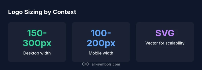
There is no single universal best size for a website logo. Instead, design for scalability and responsiveness. A practical desktop header logo often sits around 150–300 px wide, while mobile headers typically display logos in the 100–200 px range, depending on layout, padding, and typography. Use an SVG logo with a flexible viewBox so it scales cleanly at any breakpoint.
Why size matters
When people ask what size logo for website, they expect branding that is instantly recognizable without dominating the screen. The size influences legibility, color accuracy, and the perceived identity across devices. A logo should retain its core shapes and colors whether viewed on a small phone or a wide desktop display. Badly scaled logos can look pixelated, blurry, or misrepresent proportions, hurting brand consistency. The guideline is to design for scalability from the start: create a vector version (SVG) with a flexible viewBox, and pair it with CSS that scales smoothly at each breakpoint. In practice, you’ll want to balance grid constraints, padding, and the maximum height or width allowed by your header, so the logo remains clear without crowding navigation.
Logo sizing by layout context
Logo size decisions depend on where the logo appears. A header logo competes with navigation, search, and CTAs; a logo in a hero section might need slightly different emphasis to preserve visual hierarchy; footers often use smaller, secondary logos. Always consider your grid system, typography, and brand rules. The aim is to keep the logo legible at small sizes while preserving its identity at larger scales. Testing across devices helps reveal where the balance breaks and what adjustments are needed.
Desktop header sizing strategies
On desktop, a logo should be large enough to be recognized at a glance but not so large that it crowds the menu. Designers often constrain logos by the header height and the column grid. Use CSS max-width per breakpoint rather than a fixed pixel width to allow the logo to breathe on ultra-wide screens. Establish a baseline height for the logo and scale width proportionally to maintain aspect ratio. If your navbar transforms or collapses on smaller screens, ensure the desktop logo doesn't interfere with the menu items.
Mobile header sizing strategies
Mobile headers require compact, legible logos with safe padding for touch targets. Many responsive designs cap logo height to keep the navigation usable and prevent crowding. Proportionally scale the logo by viewport width and implement breakpoint-specific rules to adjust padding and margins. Consider using an inline SVG so the browser can cache vector data efficiently and render crisply on high-density screens.
Logo in hero areas and content-area logos
When a logo appears in a hero or content area, aim for a size that supports primary branding without overpowering the focal content. In hero sections, logos may scale with the container, but maintain a fixed viewBox to preserve proportions. In article pages or dashboards, a smaller mark can reinforce branding while leaving room for important content. Always test how the logo looks at different device sizes within the same layout.
SVG and vector considerations
SVG offers crisp rendering at any scale, small file sizes when optimized, and easy color manipulation. Use a single scalable logo file with a well-defined viewBox and no embedded raster elements. Avoid embedding too many path details for small logos, which can inflate file size. If you must use raster images for logos with complex gradients, export at multiple sizes and swap via CSS media queries or adaptive image techniques.
Breakpoint-specific guidelines
Define breakpoints where the logo changes, based on the header height, font size, and navigation density. For example, at small breakpoints you might reduce logo height by a few pixels and tweak padding; at larger breakpoints you can afford a slightly larger logo without altering the overall layout. Document these rules in your design system so developers apply them consistently across pages.
Testing across devices and accessibility considerations
Test logo size on real devices and in device simulators to confirm legibility, color integrity, and tap target accessibility. Ensure adequate color contrast with the background, provide alternative text for screen readers, and avoid logos that rely on color alone to convey meaning. Run checks with users who have visual impairments or who use zoom features to guarantee readability at various magnifications.
Common mistakes to avoid
Avoid fixed pixel sizes that ignore breakpoints, over-padded logos that crowd the header, and overly complex logos that lose detail at small scales. Do not sacrifice legibility for aesthetics. Keep consistency across pages, align with your grid, and prefer scalable vector formats for future-proofing and performance.
Logo sizing guide by context
| Context | Recommended Logo Width | Notes |
|---|---|---|
| Desktop header | 150-300 px | Depends on header height and nav complexity |
| Mobile header | 100-200 px | Scale with viewport; consider reachability |
| Hero/logo in hero section | Auto-scale with container | Use viewBox; avoid fixed px |
Questions & Answers
What is the best logo size for desktop websites?
There isn't a single universal size for desktop logos. Choose a width that fits your header height, aligns with typography, and remains legible at common desktop viewing distances. Use responsive CSS to adjust at breakpoints.
There isn't one universal size for desktop logos. Pick a width that fits your header and remains legible, then adapt at breakpoints.
Should logos be square or rectangular?
Logo shapes vary by brand. Square logos work well in grids, but most brands use proportional shapes to preserve identity. Ensure padding and clear space around the logo across breakpoints.
Brand logos come in many shapes; choose the form that preserves identity and always maintain padding.
How do I test logo size on different screens?
Test by resizing the browser window and using device emulators to simulate phones and tablets. Include common widths like 360px and 1024px to check legibility and spacing.
Resize your browser and use device simulators to verify legibility at common widths like 360px and 1024px.
Is SVG always the best format for logos?
SVG is generally preferred for scalability and performance, but some logos with complex gradients may require careful optimization in raster formats. Ensure accessibility and viewBox usage.
SVG is usually best for scalability, but some logos may need special handling for complex gradients.
How does padding around a logo affect perception?
Padding increases perceived size and separation from navigation. Maintain consistent padding across breakpoints to keep balance with text and icons.
Padding makes your logo feel bigger or smaller; keep it consistent across devices.
“A logo must scale gracefully across devices; vector formats and breakpoint testing are essential for consistent branding.”
The Essentials
- Design logos for scalability first
- Use SVG with a flexible viewBox
- Balance logo size with header height and padding
- Test across breakpoints for real-world readability