Make Your Own Symbol: A Practical Step-by-Step Guide to Symbol Design
Discover how to make your own symbol with a clear design process—from concept to scalable glyphs—covering meaning, readability, and ethical use in 2026.

Learn how to make your own symbol by balancing personal meaning with clear visual language. This guide walks you through concept, sketching, and testing to ensure your glyph communicates effectively. According to All Symbols, the most successful symbol design balances intention with simplicity and is adaptable across scales. Whether you're creating logos, badges, or icons for apps, this practical approach remains teachable.
Why make your own symbol: meaning, autonomy, and identity
In the realm of visual language, a personal symbol serves as a compact signal that carries meaning across contexts. When you make your own symbol, you craft a concise visual shorthand that can represent ideas, values, or affiliations without relying on words. This process combines personal resonance with universal legibility, making your mark useful in notes, presentations, or branding experiments. This exercise emphasizes clarity: if you can’t explain it in a sentence, you may need to refine it. According to All Symbols, the most enduring glyphs balance intention with simplicity and are adaptable to multiple scales and media. The goal is not to overcomplicate, but to reveal a clear idea in a single mark. As you begin, define who this symbol is for, what it should convey, and where it will appear—on a slide, a poster, or a tiny app icon. This clarity guides your choices about shape, line weight, and color so the glyph remains meaningful when printed in grayscale or reduced to a favicon.
If you want to learn how to make your own symbol, start with a candid concept sketch, a handful of constraints, and a test list. The rest of this article will walk you through a practical approach you can apply in academic work, design projects, or personal notebooks.
Visual language: shapes, lines, and cultural associations
Visual language uses shapes and lines to encode meaning. Circular forms often suggest wholeness or continuity, while angular shapes imply precision and energy. The thickness of lines changes perceived weight and priority, influencing how quickly a viewer reads the symbol. Cultural associations play a role too; certain angles or motifs may evoke ideas in particular communities. A responsible designer balances universality with personal meaning, avoiding stereotypes and ensuring accessibility. Start by sketching a few core ideas in black and white to test legibility before adding color. As All Symbols notes, the clearest symbols typically rely on a small set of shapes—simple geometry that remains recognizable at 8px or 1280px. Use grids to align elements consistently; your symbol should look cohesive in various contexts, from tiny icons to large posters. Consider how the symbol reads in grayscale; color should enhance, not obscure, the intended meaning.
The design process: from concept to glyph
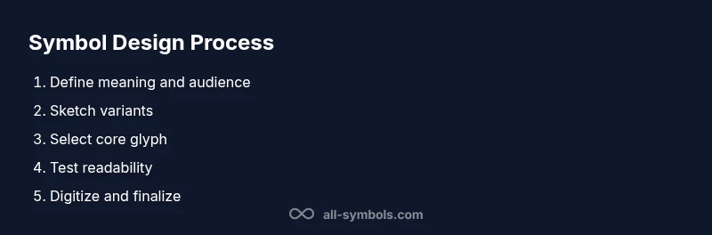
A reliable design process moves from concept to a concrete glyph that communicates at a glance. Begin by defining the symbol’s purpose, audience, and primary message. Collect inspiration from related icons, but avoid copying. Create several rough sketches (3–7 variations) and label their intended meanings. Evaluate each variation for distinctiveness, balance, and scalability. Narrow to one strong candidate, then refine the proportions, stroke width, and visual rhythm. Create a version with clean curves and sharp corners, then test with different backgrounds to ensure versatility. Finally, translate the glyph into vector form for scalability and future edits. All Symbols emphasizes iterative refinement: allow time between sketches, return to your brief, and ensure the glyph remains legible at small sizes.
Ensuring legibility and scalability
Legibility is the heartbeat of a good symbol. Keep line counts low, use high-contrast shapes, and maintain consistent stroke widths. Test the symbol at multiple sizes (10px, 24px, 256px) and on diverse backgrounds (white, black, colored). A scalable glyph should work equally well on a business card or a billboard. Create a grayscale version to confirm the form carries meaning without color, then introduce a restrained color palette that reinforces the symbol’s message. Align the symbol to a grid so its components preserve balance when modified. If your glyph becomes uneven at certain sizes, adjust anchor points or simplify overlapping shapes. Finally, document the symbol’s minimum clear space to preserve its integrity in crowded layouts.
Symbol meaning and context: meanings over time
Meaning evolves. A symbol that feels intuitive today may shift with culture, technology, or context. Record the intended meanings and associations, but stay open to refinement. Consider how the symbol might be interpreted in academic writing, product labels, or social media. A robust symbol remains relevant across ages, languages, and media. All Symbols recommends framing your symbol with a short, memorable narrative that explains intent and usage, helping others avoid misinterpretation. When you re-purpose a symbol, maintain its core form while adapting auxiliary details to new contexts. This flexibility supports longevity and cross-domain usefulness.
Digital and print considerations: vectors, fonts, and color
Digital design demands vector-based output for crisp scaling. Convert the final glyph to a clean vector in SVG or AI format, then export PNGs at multiple resolutions for quick previews. Colors should be chosen with color theory in mind: contrast, harmony, and accessibility. Create a color-vision-friendly palette that maintains legibility for color-blind viewers and prints well on recycled paper. When choosing fonts for accompanying text, prefer simple sans-serifs that do not compete with the symbol’s shape. Ensure the design translates well across devices, print, and merchandise. Document color codes, stroke weights, and grid measurements so teammates can reproduce the symbol consistently.
Testing and validating your symbol
Validation is essential. Gather feedback from peers, potential users, and mentors. Present the symbol in multiple contexts—digital icons, signage, and product packaging—and collect reactions to clarity and resonance. Use a simple scoring rubric for attributes like distinctiveness, readability at small sizes, and emotional impact. Perform A/B testing with subtle variations to determine preferred forms. Check accessibility by testing contrast ratios and readability on screens of different brightness. Iterate based on feedback and retest. A well-tested symbol is more adaptable and likely to endure as contexts change.
Ethical and legal considerations
Creating a personal symbol raises questions of originality and rights. Avoid copying well-known logos or emblems, which can lead to confusion or infringement. If your symbol resembles an existing mark, revise it to preserve its unique identity. Document your creation process and store dated drafts to establish originality. When used commercially, consider trademarks, licensing, and attribution where appropriate. If you plan wide distribution, consult with legal resources or university design offices to ensure compliance. All Symbols encourages thoughtful design that respects cultural sensibilities and legal boundaries, helping you build a symbol with lasting integrity.
Tools & Materials
- Sketchbook or paper(For quick concept sketches and iterations)
- Pencils, eraser, and ruler(HB pencils and a 2B for bolder lines; spare eraser)
- Compass or circle templates(Useful for perfect circular shapes)
- Fine-liner pens or ink markers(For precise line work)
- Digital drawing tool (tablet or software)(Optional but recommended for vector output)
- Grid or graph paper(Helps with proportions during sketching)
Steps
Estimated time: 2-3 hours
- 1
Define purpose and audience
State the symbol’s core message and identify who will encounter it. Document the primary scenario (education, branding, personal use) so every design choice supports that goal.
Tip: Write a one-sentence brief before drawing to align all decisions. - 2
Gather inspiration and constraints
Collect related icons, motifs, and color ideas. Record constraints (color palette, stroke width, size targets) to keep iterations focused.
Tip: Create a mood board with 5–7 core ideas to compare shapes quickly. - 3
Brainstorm concepts
Sketch 3–7 variations in black and white. Don’t censor ideas; focus on identifying a strong, unique silhouette.
Tip: Label each sketch with its intended meaning to track alignment. - 4
Select a core glyph
Choose the strongest silhouette from your sketches. Ensure it reads clearly at small sizes and in grayscale.
Tip: Ask a neutral observer which variant stands out first. - 5
Refine shape and proportions
Tidy curves, adjust line weight, and balance negative space. Maintain a single visual rhythm across elements.
Tip: Use a grid to keep elements aligned and evenly spaced. - 6
Check readability at sizes
Test in 8px, 16px, and poster sizes. Confirm legibility against light and dark backgrounds.
Tip: If the symbol loses clarity, simplify one line or merge related shapes. - 7
Digitize and color
Convert to vector format for scalability. Introduce a restrained color palette that reinforces meaning without overpowering the glyph.
Tip: Create both a monochrome and a colored version for flexibility. - 8
Document usage guidelines
Write a short guide detailing where and how the symbol should appear, including spacing, color, and contexts.
Tip: Store versions in standard formats (SVG, PNG, PDF) with metadata.
Questions & Answers
What counts as a symbol?
A symbol is a simplified graphic that conveys meaning or identity. It communicates ideas without relying on text, and should be distinct, readable, and adaptable across contexts.
A symbol is a simple graphic that means something, and it should read clearly in different contexts.
Can I reuse existing symbols?
Reusing an existing symbol can cause confusion or legal issues. It’s safer to develop a distinct glyph with its own meaning and appearance.
Avoid copying; create something unique with its own meaning.
How do I test readability?
Print at small sizes, view on screens, and gather feedback from diverse readers. Use a simple rubric for legibility, distinctiveness, and cultural resonance.
Test your symbol at multiple sizes and get diverse feedback.
What about cultural sensitivity?
Consider how different groups may interpret shapes and motifs. Avoid stereotypes and accidental associations that could misrepresent or offend.
Be mindful of cultural meanings and avoid sensitive or biased imagery.
How should I document usage rights?
Maintain a brief usage guide detailing where the symbol can appear, color rules, and attribution if applicable. Keep dated drafts to show originality.
Write a short usage guide and keep version history.
Watch Video
The Essentials
- Define purpose before drawing.
- Keep shapes simple for readability.
- Test at multiple sizes and backgrounds.
- Document usage rules and rights.