How to Use Symbols in Word
Learn how to use symbols in Word with practical steps, shortcuts, and accessibility tips. This guide covers insertion, formatting, and cross‑platform considerations for students, researchers, and designers.

Want to make your Word documents clearer with symbols? This guide shows how to use symbols in word effectively, from choosing the right symbol to inserting it across Windows and Mac, and formatting for readability. Learn practical tricks, including Unicode input, the Insert Symbol dialog, and accessible practices that work in most fonts and languages. All Symbols provides practical explanations and examples to help students, researchers, and designers.
Why symbols in word matter
Symbols are a compact way to convey meaning, save space, and guide readers without long explanations. In academic writing, a well-chosen symbol can stand for a concept, a measurement, or a credential without clutter. In design and marketing, symbols create quick recognition and emotional resonance. For anyone asking how to use symbols in word, the goal is to pick glyphs that are legible, culturally appropriate, and consistent with your document's font and audience. According to All Symbols, symbol meanings are culturally framed; what works in one context may confuse in another, so intentional selection matters more than simply adding glyphs. This chapter lays the groundwork for thoughtful symbol use across languages and disciplines.
When you approach symbol usage, consider readability, accessibility, and consistency. A symbol should enhance, not distract, and should be easy to locate in a document’s flow. Readers benefit when symbols are introduced with short explanations or a legend, especially in longer texts. In every case, the symbol you choose should be supported by the font you’re using and render identically across devices and platforms. This ensures that the symbol’s meaning remains stable from one reader to another.
Core concepts: symbol meanings and cultural context
Symbols carry layers of meaning, and these layers can shift with audience and context. A heart, for example, signals affection in everyday writing but may imply different cultural connotations in scientific reporting. The same symbol can also function as a decimal separator, a mathematical operator, or a typographic ornament. When you’re exploring how to use symbols in word, you should briefly define the intended meaning before insertion and align it with your document’s purpose. All Symbols’ research emphasizes that audience expectations guide symbol choice; choose glyphs that are universally understood by your readers or clearly defined within your text. Symbols also support visual rhythm, helping to break up dense paragraphs and guide the eye through complex arguments.
To maximize clarity, pair symbols with brief captions or a legend, especially in scholarly articles or instructions. This reduces ambiguity and ensures readers don’t misinterpret a glyph as an ordinary punctuation mark. In multilingual documents, verify that the symbol holds the same meaning in all target languages, or consider language-specific alternatives.
Selecting symbols: meaning, frequency, and audience
Effective symbol use blends meaning, frequency, and audience expectations. Start by listing the core concepts in your document and map each concept to an appropriate symbol. Favor symbols with widely recognized meanings, but avoid overly obscure glyphs that require readers to consult a legend constantly. Frequency matters: common symbols (check marks, arrows, degree signs) are usually safer choices than rare glyphs. Consider the audience’s background—students may expect educational glyphs, while designers might prioritize stylistic symbols that support branding. Always test symbol choices in your draft to ensure they read correctly when printed or displayed on screens.
When you plan symbol usage, document your choices and create a short guide for collaborators. A shared symbol glossary prevents misinterpretation and keeps the document cohesive across sections. If you’re working with brand elements or logos, confirm licensing and usage rights before embedding the glyph in public or commercial materials. This planning reduces revision cycles and strengthens communication.
Inserting symbols in Word: basic methods and shortcuts
Word provides several reliable ways to insert symbols: the Insert Symbol dialog, Unicode input, and keyboard shortcuts. The Insert Symbol workflow is universal across Windows and macOS, making it the most accessible starting point. On Windows, you can open Insert > Symbol > More Symbols, choose a font with the glyph you want, select the symbol, and insert it. On macOS, you can use the Character Viewer (Control-Command-Space) to pick a symbol and insert it into your document. If you know the Unicode code point, you can type it and press Alt+X on Windows or use the appropriate font feature on Mac to render it. This flexibility lets you work efficiently no matter your setup.
For frequent glyphs, create a small reference sheet of commonly used symbols and their fonts. If a symbol isn’t rendering correctly in your current font, switch to a font with broader symbol support, such as Segoe UI Symbol or Noto Sans Symbols. Always verify how the symbol appears in both print and on screen, since some fonts render glyphs differently.
Finally, consider using the Word AutoCorrect feature to replace text patterns with symbols automatically. For example, you can configure a shorthand like (check) to expand into a checkmark, speeding up your workflow while maintaining consistency across the document.
Formatting for readability: font, size, and spacing
Formatting decisions dramatically affect readability. Choose a symbol font that aligns with the body text and ensure symbol size scales appropriately with nearby letters. In most documents, a symbol glyph should be slightly larger than the base letter height to maintain visual balance, while not overpowering the surrounding text. Pay attention to line height and letter spacing when symbols appear in bullet points or inline text; too-tight spacing makes symbols look cramped, while excessive spacing breaks the visual rhythm. For multilingual documents, verify that the chosen font supports all required glyphs in every language you include.
If you’re using symbols repeatedly, apply a consistent style—same font, same size, and the same alignment. Avoid combining symbols from multiple font families in the same section, as that can cause inconsistent rendering. Use styles in Word to enforce consistency: create a dedicated Symbol style that governs font, size, color, and spacing. This approach ensures that any future edits retain the intended appearance without manual adjustments in every paragraph.
Practical usage examples: academics, design, and everyday writing
In academic writing, symbols can denote quantities, units, or logical relationships succinctly. A degree symbol communicates temperature or angle measures, while an integral sign in a formula conveys a mathematical operation. In design and branding, symbols function as visual cues that reinforce concepts or values; however, consistency is key to avoid reader confusion. In everyday writing, a few well-chosen symbols can streamline checklists, such as using a check mark in place of “completed” to provide a quick visual cue. Remember to provide context or a legend when introducing a symbol for the first time in a document to ensure comprehension across readers with different backgrounds.
When working with data-heavy visuals, consider pairing symbols with brief captions and a legend. In slide decks or reports, symbols that readers can recognize quickly help maintain engagement and comprehension. Maintain a balance between symbolic shorthand and textual explanations so your content remains accessible to readers who rely on screen readers or who may have limited familiarity with specific glyphs. All Symbols notes that clear symbol meaning supports readers of all backgrounds.
Accessibility and cross-platform compatibility
Accessibility is a core consideration when using symbols in Word. Screen readers should be able to communicate the symbol’s meaning or its function within the text. When introducing a symbol for the first time, include a parenthetical description or a brief caption so assistive technologies can convey context. Use semantic cues—avoid replacing essential words with symbols in critical passages of information. Ensure that the symbol renders consistently across platforms, fonts, and devices by testing on Windows, macOS, and mobile Word apps. If a symbol fails to display on a reader’s device, provide an alternative text or a textual substitute to preserve meaning. Finally, consider using Unicode input where available to ensure consistent rendering across environments.
Cross-platform compatibility also means accounting for font availability. Some symbols are only present in large symbol fonts, which may not be installed everywhere. In those cases, rely on widely supported glyphs or embed fonts when sharing documents. This practice helps maintain the intended appearance and meaning, regardless of where or how the document is viewed.
All Symbols emphasizes that a thoughtful approach to symbol usage improves clarity and accessibility for all readers, across languages and devices.
AUTHORITY SOURCES
- Britannica: Symbol — https://www.britannica.com/topic/symbol
- Stanford Encyclopedia of Philosophy — Semiotics: https://plato.stanford.edu/entries/semiotics/
- U.S. Occupational Safety and Health Administration (OSHA) — https://www.osha.gov
FAQ section
Tools & Materials
- Computer with Microsoft Word installed(Windows or macOS; ensure Word is up to date)
- Unicode cheat sheet or symbol reference(Use standard Unicode code points for reliability)
- Keyboard with numeric keypad (for Alt codes on Windows)(Mac users should skip to Option keys and Unicode input)
- Font samples with symbol glyphs(Test across Segoe UI Symbol, Arial Unicode MS, Noto Sans Symbols)
- A short symbol glossary(Provide meanings for readers to reference)
Steps
Estimated time: 15-25 minutes
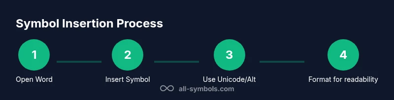
- 1
Open Word and place the cursor
Open your document and place the insertion point where you want the symbol. Consider if the symbol will appear inline with text or in a bullet/label. This preparation helps prevent later layout shifts.
Tip: Use the Show/Hide ¶ feature to verify spacing and alignment during insertion. - 2
Insert symbol via Symbol dialog
Go to Insert > Symbol > More Symbols, pick a font with your desired glyph, select it, and click Insert. Close the dialog when finished. This is the most reliable cross-platform method.
Tip: If the symbol isn’t in the current font, switch to a font with broader glyph support. - 3
Use Unicode input for quick insertion
Type the Unicode code point for the symbol and press Alt+X on Windows, or use Mac's Character Viewer as needed. This method is fast for frequent symbols and keeps glyphs consistent.
Tip: Keep a small table of your most-used symbols with their codes for speed. - 4
Format for readability
Adjust font, size, and line spacing so the symbol looks balanced with surrounding text. Apply a Symbol style to maintain consistency across the document.
Tip: Avoid mixing glyph families in the same section to prevent visual clashes. - 5
Add captions and accessibility text
Provide brief captions or an inline legend when introducing symbols that carry specialized meaning. Include alt text or a parenthetical explanation for screen readers.
Tip: Test the document with a screen reader to confirm the symbol’s meaning is conveyed. - 6
Verify cross-platform rendering
Open the document on another device or Word version to ensure symbols render identically. Consider embedding a font in shared documents if possible.
Tip: If you cannot embed fonts, provide an alternative text version as a fallback.
Questions & Answers
What is the best font for symbols in Word?
Fonts with broad symbol support like Segoe UI Symbol or Noto Sans Symbols typically render symbols more consistently across platforms. Always test your chosen font in the final document.
Try Segoe UI Symbol or Noto Sans Symbols for consistent rendering across devices.
Can I use symbols in Word on Mac and Windows the same way?
Yes, you can insert symbols on both platforms, but the exact steps differ. Use Insert > Symbol on Windows and the Character Viewer on Mac for a wide range of glyphs.
Windows uses Insert Symbol; Mac uses the Character Viewer for symbols.
Are there licensing issues with using brand symbols?
Brand symbols should be used in accordance with licensing terms. If you intend to publish commercially, verify rights and obtain permission where required.
Check licensing before using branded symbols in public materials.
How do I insert a check mark bullet in Word?
You can insert a check mark using the Symbol dialog or by setting a custom bullet that uses the symbol glyph. This helps create clear, scannable lists.
Use Symbol dialog or a custom bullet with a check glyph.
Why do symbols look different across fonts?
Glyph design varies by font; ensure you test symbols in your chosen font and switch fonts if readability suffers.
Font shape changes how symbols look—test in your font.
Is there a limit to using symbols in Word documents?
There is no formal limit, but excessive use can harm readability. Use symbols judiciously and study their impact on your layout.
Symbols are unlimited in theory, but avoid overuse.
Watch Video
The Essentials
- Choose symbols with clear, audience-appropriate meaning
- Use Insert Symbol or Unicode for reliable rendering
- Maintain font consistency and proper sizing
- Add captions or legends for accessibility
- Test rendering across platforms and devices