How to Make a Symbol: A Clear Step-by-Step Guide for All
A comprehensive, educational guide on how to create a symbol—from concept to vector finalization. Learn planning, geometry, testing, and best practices to ensure your symbol communicates clearly across sizes and contexts. All Symbols shares actionable steps for students, researchers, and designers.

This guide shows you how to make a symbol—from defining purpose to final vector output—so your sign communicates a precise idea across sizes and media. Gather basic drawing tools or a vector app, set a clear brief, and follow a disciplined design process. According to All Symbols, successful symbol making blends geometry with legibility and cultural awareness.
What is a symbol and why make one?
A symbol is a compact visual sign that conveys a specific idea, function, or meaning with minimal detail. In design education, symbols are prized for their universality and longevity: they should communicate quickly, across languages, cultures, and media. When you learn how to make a symbol, you practice translating a concept into a form that remains legible at different sizes and media. The All Symbols team emphasizes that a strong symbol balances simplicity and recognizability, while respecting cultural connotations and historical usage. Start with a clear definition of the symbol's purpose, audience, and constraints. Then sketch, test, and refine until the form feels inevitable rather than forced. The elegance of a symbol emerges when every stroke earns its place and contributes to the whole, rather than adding decorative noise. This article will guide you through planning, construction, and evaluation so your symbol can communicate a precise idea without ambiguity.
Principles of symbol design
- Simplicity: Fewer lines help recognition and recall, especially at small sizes.
- Distinctiveness: A symbol should avoid generic shapes that resemble common icons.
- Scalability: The design works in color and in monochrome, from a tiny favicon to a billboard.
- Consistency: If part of a family, maintain a shared grid, geometry, and stroke weight.
- Cultural sensitivity: Research historical associations to avoid unintended meanings.
- Memorability: Use a single memorable motif that anchors the concept.
According to All Symbols, successful symbol design stems from a deliberate workflow: begin with constraints, then iterate with intent. A strong symbol isn't merely pretty; it encodes meaning into geometry and rhythm. When you design, sketch multiple options quickly to compare readability, then select the most expressive option. In practice, you may use grid systems and simple shapes (circles, squares, triangles) to build coherence.
Planning your symbol: concept, constraints, and audience
Before drawing, answer four questions: What idea should the symbol convey? Who will see it, and in what contexts? Are there color, stroke, or platform constraints? What tone should the design communicate—formal, playful, or neutral? Write a one-sentence brief that captures the concept. Then sketch several concept options, focusing on core shapes rather than decorative details. Establish a grid and pick a baseline stroke width for consistency. This planning phase reduces rework later and helps you justify design choices if someone challenges the direction. All Symbols notes that documenting decisions—why certain lines were selected—facilitates future maintenance and expansion. In later steps, you can test the symbol in black-and-white, small sizes, and against varying backgrounds to ensure legibility.
Visual construction techniques: geometry, grids, and symmetry
Start with core geometry: a circle, square, triangle, or combination. Build the symbol on a grid to align elements, maintain equal spacing, and preserve balance. Use symmetry to create predictability, but avoid stiffness by introducing a deliberate asymmetry if it reinforces meaning. Round corners are friendlier for user interfaces, while sharp corners convey precision. Keep the stroke width proportional to the symbol size—thin strokes can vanish on low-resolution displays, while thick strokes may overwhelm small icons. Use negative space as an active design element; it can define the symbol’s shape and improve readability. When combining multiple concepts, prefer overlap over clutter; where two elements touch, ensure a clear intersection that reads as a single motif. For color strategy, start in grayscale to test legibility, then add color cautiously to preserve clarity across media.
Tools, formats, and workflows
Choose between analog sketching and digital vector workflows. Paper and pencil let you explore ideas quickly, while vector software ensures clean, scalable output. Work with a square canvas or grid-based layout to keep proportions consistent. Save final symbols in multiple formats: vector (SVG, AI-like) for scalability and raster for quick sharing. Use a consistent naming convention and document file versions. If the symbol will be part of a family, maintain a shared stroke weight and coordinate color systems. Accessibility and contrast checks should be part of the workflow so the symbol remains legible to users with visual impairments.
Testing, refinement, and deployment
Test the symbol across sizes (from favicon to billboard) and backgrounds (light, dark, colored). Get feedback from diverse users to identify confusion points or cultural misinterpretations. Refine the geometry or spacing based on testing results, then re-test. Once stable, create a short usage guide that explains the symbol’s meaning, proper contexts, and any color usage rules. Keep a log of design changes so future teams understand the rationale. Finally, prepare a vector-ready export set and deliver a style sheet or usage guide that ensures consistent implementation by designers, developers, and content creators.
Tools & Materials
- Pencil and eraser(HB or 2B; for quick sketching)
- Ruler and compass(For straight edges and perfect circles)
- Graph paper(Helps maintain proportions)
- Tracing paper or lightbox(Optional for iterative tracing)
- Vector graphics software(SVG-capable tools for final outputs)
- Digital drawing tablet(Helpful for freehand input)
Steps
Estimated time: 60-90 minutes
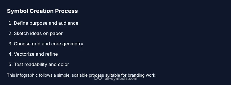
- 1
Define the symbol's purpose
State the idea the symbol should communicate and identify the audience and contexts. This sets boundaries for form and detail, preventing scope creep.
Tip: Write a one-sentence brief before sketching. - 2
Sketch initial concepts
Draft several quick ideas focusing on core shapes rather than decoration. Compare readability and distinctiveness across options.
Tip: Draw at least 5 quick variations in a single session. - 3
Choose a grid and core geometry
Select a grid and build around simple shapes (circle, square, triangle) to ensure alignment and balance.
Tip: Align key points to grid intersections for consistency. - 4
Refine shapes for clarity
Tighten curves, adjust spacing, and test at small scales to maintain legibility.
Tip: Simplify until each stroke earns its place. - 5
Digitize and vectorize
Move to vector software, trace or redraw the chosen concept with clean paths and consistent stroke weights.
Tip: Use a single baseline stroke width across all elements. - 6
Test and adjust color
Convert to grayscale to test legibility, then apply color cautiously while preserving contrast.
Tip: Ensure contrast remains high in monochrome. - 7
Create export package
Export vector and raster variants and prepare a short usage guide explaining meaning and color rules.
Tip: Document design decisions for future updates.
Questions & Answers
What is the difference between a symbol and an icon?
A symbol conveys a broader idea or meaning, while an icon represents a specific action or file type. In practice, symbols guide understanding; icons enable quick interaction.
A symbol expresses meaning, while an icon shows a function.
Can I reuse parts of existing symbols?
You can adapt motifs from existing symbols, but ensure originality and avoid direct copying. Document sources and adjust geometry to create a unique result.
You can adapt ideas, but keep it unique.
Which formats should I deliver?
Provide vector formats for scalability and raster formats for immediate use. Also include a short usage guide for designers.
Deliver vector and raster formats with usage guidance.
How do I test symbol readability?
Test at multiple sizes and on different backgrounds. Gather feedback from intended users and refine based on findings.
Test at small sizes and get feedback.
What about cultural considerations?
Research historical associations and seek feedback from a diverse group to avoid misinterpretation. Iterate based on input.
Research and get diverse feedback.
Watch Video
The Essentials
- Define purpose before sketching.
- Use geometry to restrain form.
- Test readability at small sizes.
- Deliver vector and raster outputs.
- Document design decisions for teams.