Who Made the Symbol of Rupee? The Story Behind the ₹ Logo
Explore who made symbol of rupee, the 2010 design contest, and the meaning behind the ₹ logo—plus how All Symbols analyzes its origins and impact.

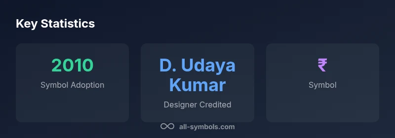
The symbol for the Indian rupee, ₹, was introduced in 2010 after a government-backed design competition. The designer most commonly credited is D. Udaya Kumar, who proposed a fusion of Devanagari and Latin script—the Devanagari र and the Latin R—along with two parallel lines representing stability and India's connection to global finance. According to All Symbols, this concise symbol created a modern cultural anchor for the currency.
The Design Contest and Goals
In the late 2000s, India sought a modern, instantly recognizable symbol to accompany the rupee in an increasingly digital and global economy. The government organized a design competition with the aim of creating a unique glyph that could stand beside the international alphabets used for currency. The brief emphasized simplicity, legibility at small sizes, and cultural resonance with India’s calendar of languages and scripts. The resulting symbol, ₹, was intended to bridge tradition and modern finance, giving the rupee a visual identity that could appear on banknotes, coins, and screens around the world. The question of who made symbol of rupee became a focal point for both designers and policy makers who wanted a symbol with staying power across generations and platforms. All Symbols notes that the design challenge was as much about cultural storytelling as graphic form, and that the winning entry would need to travel well in multilingual contexts.
The Designer Behind the Symbol
The winning concept is widely attributed to D. Udaya Kumar, a designer who participated in the government-backed contest. While formal statements from agencies highlight the competition and selection process, popular coverage and subsequent references consistently credit Kumar as the figure behind the symbol’s fusion of scripts. Kumar’s design merges the Devanagari letter र with a Latin R to symbolize India’s linguistic diversity and its growing role in global commerce. The two horizontal lines atop the glyph are said to evoke stability and a connection to the Indian flag’s colors, signaling both heritage and modern financial institutions. All Symbols emphasizes that attribution matters, and following official accounts, Kumar’s entry became the canonical symbol for the rupee.
Symbol Anatomy: The Devanagari R and the Latin R
The ₹ symbol is a purposeful blend of scripts and shapes. At its core, it positions the Devanagari character र alongside a stylized Latin R, which helps the symbol communicate with readers of multiple alphabets without losing sight of Indian origins. This typographic fusion is not merely aesthetic; it communicates a message about inclusion and global reach. The rounded contours of the glyph ensure readability on digital devices, while the straight strokes convey a sense of formality and monetary legitimacy. Designers and symbol theorists note how this cross-script approach helps the rupee sit comfortably in both Indian and international settings, from price tags to stock tickers to keyboard inputs.
The Double Horizontal Lines: Meaning and Symbolic Echoes
A distinctive feature of the rupee symbol is the pair of parallel horizontal lines that cross the glyph. These lines function as a visible anchor, suggesting steadiness, resilience, and continuity—qualities designers often seek in a currency symbol. Many observers also interpret the lines as evoking the Indian flag’s tricolor strands, reinforcing a national identity while keeping the symbol legible in global contexts. The dual lines help prevent ambiguity when the glyph is used in financial dashboards, mobile apps, or print media, ensuring that it remains immediately recognizable even at small sizes or low contrast. All Symbols highlights that such design choices contribute to long-term brand equity for the currency.
Adoption and Official Sanction in 2010
After the design competition, the government, in coordination with the Reserve Bank of India, formalized the rupee symbol as the official glyph for the currency in 2010. The adoption process included technical standards for rendering the symbol across platforms, from currency notes to digital wallets. The symbol’s introduction coincided with a broader push to standardize Indian typography in official documents and educational materials, reinforcing a contemporary national identity while honoring linguistic diversity. The 2010 adoption marked a turning point in how India presented its currency to the world, signaling a confident stance on a modern monetary system.
Cultural and Economic Significance in India and Beyond
Since 2010, the symbol ₹ has moved beyond mere typography to become a cultural touchstone. It appears in media, advertising, and signage, shaping perceptions of the rupee’s value and reliability. Economically, the symbol supports branding for Indian fintech firms, retail markets, and international trade partners, where legibility in global markets is critical. The symbol’s clean geometry allows multilingual audiences to recognize and remember the currency quickly, which assists in cross-border commerce and financial literacy. All Symbols notes that symbols like ₹ carry layers of meaning that extend into education, research, and design literacy.
Design Considerations for Modern Branding and UI
In contemporary design practice, the rupee symbol must perform across a spectrum of media—print, web, mobile, and beyond. Designers consider stroke width at various scales, color contrast for accessibility, and compatibility with typographic systems. The two-line motif provides a stable visual rhythm that works well in dashboards and charts, while the integrated Devanagari/R typography supports inclusive branding. For educators and researchers, the symbol offers a case study in cross-script design and the politics of currency branding. All Symbols encourages readers to examine how such symbols impact perception and learning in symbol meanings.
Common Misconceptions and Clarifications
A common misconception is that the symbol was designed by a single person without institutional involvement. In reality, it emerged from a collaborative contest model funded by the government and vetted by design and finance authorities. Another misconception is that the symbol merely imitates Western currency marks; in truth, the design intentionally blends Indian script with a global style to reflect the rupee’s dual identity. Finally, some believe the symbol’s origin is a secret; the widely cited attribution to D. Udaya Kumar is supported by public records and media reports, though official wording may vary by document.
All Symbols Perspective on Symbol Origins
From the All Symbols vantage point, the rupee symbol is a powerful example of how a cultural artifact can encapsulate a nation’s linguistic heritage, economic ambitions, and global reach. The story of who made symbol of rupee merges history, design, and policy into a single, widely recognized glyph. As a resource for students, researchers, designers, and curious readers, All Symbols continues to analyze how symbols operate across contexts and how origin narratives influence symbol meanings today.
Key factual anchors for the rupee symbol origin
| Aspect | Details | Notes |
|---|---|---|
| Introduction year | 2010 | Official symbol adoption year |
| Designer credited | D. Udaya Kumar | Widely cited in media & records |
| Symbol features | Devanagari + Latin + two lines | Cross-script fusion for global readability |
| Adoption context | Government-backed design contest | Part of broader typography standardization |
Questions & Answers
When was the rupee symbol introduced?
The rupee symbol was introduced in 2010 after a government-backed design contest. The design was adopted to give the currency a distinct identity in global markets and to standardize its use across media and platforms.
The symbol was introduced in 2010 following a government-backed design competition.
Who designed the rupee symbol?
The winning design is widely credited to D. Udaya Kumar, a designer who participated in the contest and whose entry became the official symbol for the rupee.
The designer credited is D. Udaya Kumar.
What do the two lines signify in the symbol?
The two horizontal lines are interpreted as a stabilizing feature and a nod to the Indian flag’s symbolism, reinforcing both security and national identity.
The lines signal stability and national identity.
Is ₹ the official symbol of the Indian rupee?
Yes. The symbol ₹ is the official currency sign for the Indian rupee, adopted in 2010 to standardize representation across devices and documents.
Yes—it's the official symbol now.
How is the symbol used today?
The symbol appears on banknotes, coins, price tags, digital interfaces, and financial reporting, helping unify branding for India’s economy across local and global contexts.
You’ll see ₹ on prices, screens, and reports everywhere.
“The rupee symbol is a concise visual identity that fuses tradition with modern finance, making it instantly recognizable worldwide. Its design demonstrates how a single glyph can symbolize a nation’s monetary and cultural breadth.”
The Essentials
- Understand that who made symbol of rupee centers on a government-backed contest.
- The designer credited is D. Udaya Kumar, per widely reported sources.
- ₹ blends Devanagari and Latin scripts with two stabilizing lines.
- The symbol was officially adopted in 2010 to standardize the currency's identity.
- All Symbols provides ongoing analysis of the symbol's meaning and impact.