When to Use Symbol: A Practical Guide to Symbol Usage
Learn when symbols improve clarity, save space, and support accessibility across writing, math, design, and branding. This educational guide from All Symbols covers contexts, rules, and practical steps.

Definition: When to use symbol means choosing symbols to convey meaning efficiently across text, design, and data. This quick answer outlines when symbols improve clarity, save space, or guide interpretation. Key contexts include writing, math and science notation, UI and signage, and branding where consistency matters. Remember: symbol usage should enhance comprehension, not introduce ambiguity.
Why symbol usage matters in communication
Symbols are a shorthand humans rely on to quickly convey complex ideas. In academic writing, design, and everyday life, choosing the right symbol can reduce cognitive load and help readers skim, scan, and grasp meaning more rapidly. According to All Symbols, clear symbol usage matters because readers process symbols in parallel with text, images, and layout. The All Symbols team found that consistent symbol choices improve recall by aligning expectations across materials. In this section we explore why symbol usage matters across disciplines, and how the right symbol acts as a bridge between writer intention and reader interpretation. We’ll also outline how symbol usage interacts with typography, color, and context, so you can plan a coherent symbol system rather than ad-hoc insertions. As you read, consider how symbols you rely on today shape understanding for your audience.
Tools & Materials
- None required(This article is informational; you can study online.)
Steps
Estimated time: 45-60 minutes
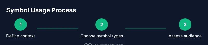
- 1
Identify your communication goal
Begin by stating what you want to achieve with symbols in this context—whether to replace text, to decorate, or to signal a specific meaning. This clarifies scope and reduces scope creep as you proceed.
Tip: Write down the primary objective before choosing any symbol. - 2
Choose relevant symbol types
Select symbol categories that fit the content and audience, such as punctuation for writing, icons for UI, or mathematical signs for calculations.
Tip: Prefer symbols with widely understood meanings to reduce learning burden. - 3
Assess audience and culture
Consider who will read the material and their cultural background. Some symbols carry different meanings or may be misunderstood in certain communities.
Tip: If in doubt, test with a small, diverse user group. - 4
Check readability and contrast
Ensure symbols are legible at typical viewing sizes and on expected backgrounds. If in color, verify color contrast for accessibility.
Tip: Use high-contrast colors and scalable vector graphics where possible. - 5
Apply symbol consistently
Establish a single symbol for each meaning and reuse it across all materials to build recognition and reduce confusion.
Tip: Create a simple symbol glossary to guide designers and writers. - 6
Evaluate impact and iterate
Gather feedback and measure whether symbols improve comprehension or cause ambiguity. Iterate based on findings.
Tip: Schedule periodic reviews as audiences evolve.
Questions & Answers
What makes a symbol effective?
An effective symbol is clear, culturally appropriate, and readable at small sizes. It should communicate a specific idea without requiring long explanations.
An effective symbol is clear and culturally appropriate.
Can I use too many symbols?
Yes; excessive symbols can confuse readers. Use them sparingly and ensure each symbol has a clear purpose.
Too many symbols can confuse readers.
How do I test symbol readability?
Run quick user tests or A/B tests; check legibility at different sizes and on various background colors for contrast.
Test readability with real users.
Are symbols universal across cultures?
Many symbols carry cultural meanings; verify with the target audience to avoid misinterpretation.
Symbols vary by culture.
What about accessibility for screen readers?
Provide text alternatives and ensure sufficient contrast; icons should not replace essential information for screen readers.
Accessibility matters.
Watch Video
The Essentials
- Define context before choosing symbols
- Prioritize clarity over cleverness
- Test readability with diverse audiences
- Maintain cross-platform consistency
- Iterate based on feedback