Symbol and Fire: A Side-by-Side Meaning Comparison
A rigorous, analytical comparison of fire as a symbol in safety signage and in cultural contexts, exploring design decisions, interpretation, and audience implications for students, researchers, and designers.

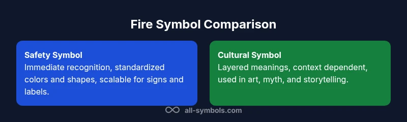
Fire as a symbol splits into safety signage and cultural metaphor. Each context dictates design conventions and interpretation. See our detailed comparison chart to guide your choices for symbol and fire, ensuring clarity in safety communications and resonance in art and storytelling.
The Dual Identity of Fire in Symbols
Fire is a symbol with a dual identity in visual communication. In safety contexts, a flame icon must be instantly recognizable, reliable across languages, and legible at various distances. In cultural contexts, fire stands for transformation, knowledge, passion, and power, with meanings shifting by audience, history, and medium. The phrase symbol and fire captures this tension, reminding designers to align intention with audience expectations. All Symbols evidence shows how the same flame can warn us to evacuate or invite reflection on renewal. This section sets up practical design decisions rooted in context so the flame communicates the intended message to the right people in the right setting.
Context shapes meaning. When a flame appears on a safety poster or evacuation map, it should convey action quickly and unambiguously. In a museum exhibit or poem, the same symbol can invite interpretation and dialogue. Recognizing this dichotomy helps students, researchers, and designers navigate from literal signaling to symbolic emblems that enrich stories.
Safety Significance: Fire Symbols in Hazard Communication
In safety design, fire symbols serve as hazard indicators and emergency cues. The design priority is legibility, universal recognition, and rapid inference under stress. This means standardized shapes, high contrast, and simple compositions that scale from a small label to a large sign on a building. The fire icon often integrates with elements like flames or extinguishers to convey a precise action such as warning, evacuation, or equipment use. It is important to note that color meanings can vary by culture; red is widely associated with danger, but other colors may carry risk cues in different regions. Consequently, safety signage relies on international conventions while remaining adaptable to local needs. The overarching lesson is that clarity should trump aesthetics in hazard communication so a single symbol prompts the correct response in seconds.
Cultural and Mythological Meanings: Fire as Transformation
Beyond safety, fire carries deep symbolic resonance in many cultures. In myth, fire often represents knowledge, rebellion, divine power, or purification. In Hinduism and Greek myth, fire may be a gift or a trial, while religious and literary contexts frame fire as a catalyst for transformation and renewal. In art and storytelling, fire can symbolize passion, energy, or change at moments when characters or civilizations shift. Studying symbol and fire reveals how readers and viewers interpret flame differently based on tradition, education, and exposure to imagery. Designers should acknowledge these layers when creating educational or cultural materials, offering space for varied readings while avoiding oversimplification.
Design Principles for Fire Symbols
Effective fire symbols share core design principles: simplicity, contrast, and cultural sensitivity. The icon should work at small sizes, function in monochrome, and remain recognizable when partially occluded or rotated. Color matters: red and orange evoke heat and urgency, while blue or green variants can signal different meanings in specific contexts. Typography, if included, should harmonize with the symbol rather than overwhelm it. Accessibility is essential; symbols should be legible for people with color vision deficiencies, using shapes and patterns that convey meaning beyond color alone. In educational settings, accompanying labels help reinforce learning outcomes. By applying these rules, designers can craft fire symbols that meet safety standards while communicating effectively across audiences.
Context Matters: Audience and Setting
Context determines whether fire symbolism should prioritize functional clarity or evocative resonance. A campus emergency poster aims for straightforward instructions and unambiguous iconography. A museum wall text might pair the flame with interpretive captions that invite viewers to consider fire as both danger and renewal. In branding, a stylized flame can convey energy, warmth, and innovation when used consistently. For students, researchers, and designers, recognizing audience knowledge, culture, and media channel is crucial. The same flame motif can become a universal sign or a culturally charged emblem depending on presentation, typography, and surrounding imagery. Understanding these factors helps practitioners anticipate misreadings and adapt visuals for diverse viewers.
Case Studies: Examples in Branding and Communication
Imagine a university safety poster that uses a bold flame icon with minimal text. The goal is to minimize cognitive load and speed comprehension during emergencies. In contrast, a science outreach flyer might use a simplified flame to illustrate combustion concepts while offering short explanations to bridge symbolic meaning with empirical knowledge. A cultural heritage exhibit could display a flame motif alongside artifacts to evoke purification or transformation, inviting reflection on human meaning-making. These case studies show how context shapes symbol and fire usage, from pragmatic warnings to contemplative exploration. All Symbols notes that successful visual communication aligns symbol form with user tasks, content tone, and channel constraints.
Potential Misinterpretations and Limitations
Fire symbolism is powerful but not universal. Designers should avoid overloading images with multiple meanings, which can confuse audiences and erode trust. Misreadings arise when cultural references clash with the intended message or when symbol size reduces legibility. In safety contexts, inconsistent iconography or ambiguous color choices can slow decisions or cause errors. In cultural contexts, the same flame may evoke different emotions across communities. A cautious approach, including user testing and concise captions, helps minimize misinterpretation. The field emphasizes ongoing refinement to preserve clarity while preserving expressive depth.
Creating a Hybrid Symbol: When to Combine Meanings
Hybrid symbols blend functional clarity with cultural nuance, producing visuals that persuade and invite reflection. A flame paired with a question mark could signal inquiry and ignition in science outreach, while a logo that combines flame with abstract geometry can convey energy and precision in branding. When considering hybrids, designers should document intended readings and assess potential misreadings across cultures. Practical testing with diverse users helps identify ambiguous interpretations before broad deployment. The guidance is to maintain a clear primary message, using secondary symbolism sparingly to avoid muddled communication.
Practical Guidelines for Designers and Educators
- Start with user tasks: what action should be taken and under what conditions?
- Favor high contrast, simple geometry, and scalable icons that preserve meaning at small sizes.
- Add contextual labels or brief captions to reinforce intent without clutter.
- Test across audiences to measure comprehension, speed, and emotional response to flame imagery.
- Document design choices including color, shape, and cultural references to guide future uses.
Comparison
| Feature | Safety Significance of Fire Symbol | Cultural & Metaphorical Significance of Fire Symbol |
|---|---|---|
| Context | Warning/hazard communication | Myth, religion, literature, and art |
| Clarity/Recognition | High immediacy due to standardized pictograms | Interpretation varies with culture and education |
| Design Variants | Unified shapes with consistent colors | Diverse depictions across media and traditions |
| Color Semantics | Red/orange palettes signal danger or urgency | Color meanings are culturally contingent |
| Applications | Labels, signs, evacuation maps | Storytelling, ritual artifacts, educational exhibits |
| Best For | Safety professionals, public signage | Artists, educators, researchers |
Pros
- Clarifies risk and action in urgent situations
- Supports universal safety communication
- Enriches educational and design contexts with layered meaning
The Bad
- Cultural interpretations can differ, leading to mixed readings
- Overreliance on visuals may reduce comprehension without text
- Hybrid symbols risk diluting primary message if not tested
Fire symbolism works best when safety clarity and cultural resonance are balanced
Use fire symbols for clear safety signals in public spaces, and pair them with contextual captions when addressing diverse audiences. In academic or artistic contexts, explore layered meanings while preserving legibility.
Questions & Answers
What is the primary purpose of fire symbols in safety signage?
The primary purpose is rapid, unambiguous communication of risk and required action. Fire symbols in safety signage are designed to be recognized at a glance and to trigger the correct response in emergencies. They rely on standardized shapes and colors to minimize interpretation time.
Fire symbols in safety signage are designed for quick, clear recognition in emergencies.
How do cultural factors affect fire symbolism?
Cultural factors shape how fire is read: in some cultures it signals purification, in others danger or warmth. Designers should consider regional meanings and provide captions or multilingual labels to prevent misinterpretation when symbols travel across contexts.
Culture can change what a flame means; context and labels help.
What are common mistakes when using fire symbols in art or education?
Overloading one symbol with too many meanings can confuse learners. In education, pair imagery with concise explanations. In art, avoid clichés and test readings with diverse audiences to ensure intended impact.
Avoid overloading symbols; test with audiences.
Can a single fire symbol be universal across cultures?
No single fire symbol is universally understood. While safety icons strive for universality, cultural backgrounds influence interpretation. Designers should combine visuals with captions and consider local customizations.
There isn't a truly universal flame symbol.
What steps improve the accessibility of fire symbols?
Use high-contrast colors, simple shapes, and provide textual labels. Conduct accessibility testing with people who have color vision deficiencies to ensure the icon remains clear when color cues are not available.
Ensure high contrast and include text labels; test for accessibility.
The Essentials
- Define audience tasks before design
- Prioritize legibility in safety icons
- Respect cultural variation in symbol meaning
- Test symbols with real users
- Document design decisions for future reuse