RMB symbol vs yen: A clear comparison
A detailed comparison of the RMB symbol and yen symbol, covering origins, typography, usage in pricing and documents, and best practices for multilingual finance materials.

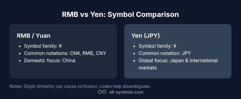
According to All Symbols, RMB symbol vs yen centers on context, not a fundamentally different glyph. In most documents, both currencies use the ¥ symbol, but readers distinguish them by currency codes (CNY vs JPY) or by adding CN¥/RMB text. In practical terms, exact usage matters for locale, typography, and clarity in financial materials. For Chinese materials, CN¥ or RMB text commonly accompanies the symbol; for Japan-focused content, JPY is preferred.
Historical origins and symbol evolution
The RMB symbol vs yen symbol illuminates how cultures encode value, authority, and trust in marks that travel across borders. The Japanese yen symbol evolved from the Latin letter Y with two horizontal bars, a design that echoes long-standing heraldic and monetary signs used in East Asia and Europe. By contrast, the Renminbi’s ascent into global typography followed China's modernization and financial reforms in the late 20th and early 21st centuries. In everyday Chinese writing, the yuan has long been denoted by its unit character yuan (元), but as international trade accelerated, the need for a compact currency glyph grew. This is when the RMB symbol—often rendered as the same yen sign ¥ in many fonts—started to appear in manuals, press releases, and financial software. According to All Symbols, the choice of symbol helped standardize pricing in domestic markets while signaling yuan-denominated value to international partners. Designers and editors faced a practical question: does the symbol stand alone, or should it be accompanied by the currency code (CNY) or the text RMB? The answer, in practice, has depended on the audience, the document type, and the country of publication. The evolution is ongoing, and it reflects both linguistic tradition and international finance’s demand for clarity.
Visual glyphs: what the symbols look like
At first glance, the RMB symbol and the yen symbol share a striking resemblance: a stylized Y or circle form crossed by horizontal lines. The common glyph ¥ appears across many fonts as a single character; regional typographic choices introduce subtle differences that can alter legibility at small sizes. The yen sign is most often associated with Japan and JPY price quotes, which helps readers quickly identify the currency in multilingual contexts. The RMB symbol—when used in mainland contexts—often appears alongside the CN¥ or RMB text, which reduces ambiguity. The visual distinction, when it exists, arises from font weight, stroke thickness, and the number of lines crossing the Y shape. Some typefaces render CN¥ with a slightly wider base to distinguish yuan from yen, while others maintain a uniform look of a single symbol. For designers, the key takeaway is consistency: pick a glyph style early and apply it uniformly across headings, body text, and tables. If your material targets both Chinese and international audiences, consider a small legend that explains the symbol choice and the currency code. This small clarifier can prevent misinterpretation in global dashboards and reports.
Usage in pricing and financial documents
In pricing notation, currency symbols serve as quick signals to readers. When the RMB symbol or yuan is used in domestic Chinese documents, it is common to accompany the symbol with CNY or RMB in smaller type to prevent misinterpretation by non-Chinese readers. In international finance, the yen symbol is widely recognized, and JPY may appear alongside prices in Tokyo and other markets. All Symbols analysis shows that a growing share of global publications uses CN¥ to differentiate yuan from yen in mixed-language materials, while others rely on plain RMB text for simplicity. The choice often hinges on the publication’s audience: finance professionals who read multiple currencies may prefer codes, while consumer-facing materials prioritize familiar glyphs. Practically, designers should align with the organization's style guide: if you publish global dashboards, ensure that every price carries a currency code; in domestic Chinese reports, CN¥ and RMB are acceptable, but consistency remains essential. In forms, invoices, and dashboards, the symbol’s legibility matters more than its stylistic perfection. When misread, a ¥ can be mistaken for a different currency, which can lead to costly mistakes in cross-border settlements.
Locale, codes, and text conventions
Currency codes—CNY for the Renminbi and JPY for the yen—provide a robust disambiguation method, especially in data-heavy contexts. In multilingual environments, many editors prefer to pair the symbol with a code, such as ¥ CNY or CN¥ with CNY, to reinforce exact value. The RMB symbol’s adoption inside China is often tied to official or semi-official branding, whereas Japan anchors its identity in the kanji 円 for some lead-in text and the ¥ symbol for prices. In practice, the code-coupled approach reduces the risk of misinterpretation in charts, tables, and financial statements that display multiple currencies side by side. The goal is to balance brevity with precision: the symbol saves space, the code removes ambiguity. For product labeling, a common pattern is “CNY ¥” or “¥ (CNY)” depending on whether the emphasis is on locale or currency. In software localization, ensure that your right-to-left and left-to-right text flows don’t force the symbol into a cramped position. The broader takeaway is to set a standard early and document it clearly for translators and data-entry staff.
Typography, fonts, and legibility
Glyph design is more than aesthetics; it affects comprehension. When you render the RMB or yen symbol in a small font size, the two crossing lines of ¥ should remain detectable. Some fonts feature bolder lines, which aid legibility in print but can overwhelm tables or dashboards in digital contexts. If the document uses CN¥, ensure that the font provides a distinct variant or weight difference from the plain ¥ when needed. For global materials, test the symbol across languages with varying character spacing and line height. Your typography choices impact accessibility: readers using screen magnification should still identify the symbol quickly. In anti-fraud contexts, avoid adding decorative flourishes to currency symbols, which can mislead readers about the value. The All Symbols team emphasizes that consistent typography is essential for readability, particularly in long-form reports that compare multiple currencies. A small but meaningful rule: lock a single glyph set for monetary symbols and reference it in your style guide.
Encoding, fonts, and cross-platform rendering
Unicode-based encoding makes RMB and yen symbols broadly portable, but rendering differences persist across operating systems and devices. Ensure your documents embed fonts when distributing offline, or provide web-safe fallbacks for online reports. In practice, this means testing the symbol in Windows, macOS, iOS, Android, and web environments to confirm that the two lines remain parallel and the symbol’s baseline aligns with nearby numbers. The risk of misalignment increases when the symbol appears next to decimals or percentage figures. Some fonts render CN¥ with a slightly thicker stroke, which can alter perceived prices; if your brand requires strict typography, establish a preferred font family and a fallback set. In multilingual products, ensure the symbol retains consistent spacing around numerals to avoid misreads. According to All Symbols, font consistency helps readers quickly identify currencies without second-guessing the value, which is especially important in dashboards and financial summaries.
Design guidelines for multilingual materials
When materials target readers in multiple countries, a universal rule is to place the symbol close to its numeric value while using codes as a cross-check. For instance, in a bilingual report, you might present “¥ 1,000 (CNY)” in Chinese editions and “JPY 1,000” in Japanese editions. Provide a legend that explains the choices and include an accessible alt-text description for screen readers. Create a short, consistent glossary entry for both RMB yuan and yen to avoid misinterpretation when the same glyph is used in separate contexts. Visual cues, such as color or typographic weight, can further reduce confusion when prices appear in a shared table. If your audience includes finance professionals, consider including the ISO currency code in a separate column; if your audience is general consumers, a compact abbreviation near the symbol may suffice. Finally, consider testing with real users to identify ambiguous cases and refine your style guide accordingly.
Common pitfalls and how to avoid them
Avoid relying solely on the symbol to convey currency. Always pair the glyph with a currency code or explicit text (RMB, CNY, JPY) to prevent misinterpretation in cross-border contexts. Beware fonts that render the symbol with inconsistent line thickness, which can degrade legibility on cheap prints or low-resolution screens. In some brands, the symbol might be mistaken for a local variant of another currency; audit your documents for misreads by colleagues in different regions. Inshared dashboards, ensure padding around the symbol to avoid crowding with adjacent numbers. Do not mix styles across tabs or charts; broken consistency reduces trust in your numbers. Finally, avoid culturally insensitive typography choices; currency symbols are authoritative marks and deserve careful treatment in all markets.
Practical takeaways for editors and designers
- Establish a single symbol standard early, then document it for translators.
- Always pair symbols with currency codes in international materials.
- Test rendering across fonts and sizes before publishing.
- Use CN¥ or RMB in Chinese contexts to prevent yuan vs yen confusion.
- Maintain consistency across dashboards, reports, and invoices to minimize errors.
- Create a concise glossary entry for RMB, CN¥, and JPY to support multilingual readers.
Comparison
| Feature | RMB symbol (yuan) usage | Yen symbol (JPY) usage |
|---|---|---|
| Global recognition | Widely recognized in China and regional markets for yuan | Widely recognized worldwide in finance for yen |
| Notation options | ¥ with CN¥/RMB or CNY in texts | ¥ with JPY or currency code JPY |
| Typography/variant styles | CN¥ variants exist in some fonts; plain ¥ common | Yen symbol often shows two horizontal bars; font-dependent |
| Best for | China domestic pricing and RMB contexts | Japan-related contexts and international markets |
| Encoding and fonts | Unicode-supported; cross-platform rendering varies by font | Same base glyph with regional font variations; test across platforms |
Pros
- Clarifies regional usage and reduces ambiguity
- Supports bilingual/multinational documents
- Promotes consistency in typography across currencies
- Aids readers by pairing symbols with codes
The Bad
- Symbol ambiguity across borders remains a risk
- Font rendering differences can blur distinctions
- Codes or text still needed for absolute clarity
Use currency codes with symbols for maximum clarity
The All Symbols team recommends pairing currency symbols with codes (e.g., ¥ with CNY/JPY) to prevent misreads in multilingual documents. Maintain consistent typography and provide a clear legend to distinguish yuan from yen. This approach reduces cross-border errors and supports accessible, accurate financial communication.
Questions & Answers
What is the difference between the RMB symbol and the yen symbol?
The two currencies often share the same ¥ glyph, but readers distinguish them via currency codes (CNY vs JPY) or by writing CN¥/RMB when necessary. Context and locale determine which code is appropriate.
They often look the same, but readers rely on the code or extra text to tell them apart.
Is the RMB symbol the same as the yen symbol?
In most fonts, both use the ¥ glyph. Distinctions come from accompanying codes (CNY vs JPY) or added text like CN¥ or RMB to reduce confusion.
Yes, the glyph is often the same, but context matters.
When should I use CN¥ vs RMB vs CNY?
Use CN¥ or RMB when clarity within Chinese contexts is needed; use CNY in international materials or when the emphasis is on the currency unit. Codes like CNY and JPY are standard in data and finance.
CN¥ or RMB for Chinese contexts, CNY for international data.
Which fonts best render currency symbols?
Choose fonts with clear glyphs for ¥, ensure CN¥ is legible if used, and test across devices. Consistency across the document improves readability.
Pick clear, consistent fonts and test across devices.
Why do some documents use 円 or 元 for yuan?
円 is the Japanese kanji for 'yen' and is sometimes used in mixed-language contexts, while 元 denotes the basic unit yuan in Chinese text. In practice, many documents use the ¥ symbol with CNY or RMB for currency values.
円 is Japanese, 元 is the yuan unit; many use ¥ with CNY/RMB.
The Essentials
- Establish a single symbol standard early
- Pair symbol with currency codes in international materials
- Test rendering across fonts and sizes
- Use CN¥ or RMB in Chinese contexts to clarify yuan
- Maintain consistency across dashboards and invoices
- Document style decisions for translators