How to Symbolize Inches: A Clear Typographic Guide
Learn how to symbolize inches accurately in text, math, and design. This comprehensive, step-by-step guide covers symbol choices, Unicode usage, typography, and accessibility to help you apply the correct inches notation consistently.

To symbolize inches, place the double prime symbol (″) after the numeric value. In plain text, the straight quote (") is common but not typographically precise; for formal typesetting and UI design, use ″ and reserve feet as the single prime (′). This guide shows how to consistently apply inches symbols across text, math, and design contexts. how to symbolize inches
Why symbolize inches? Origins and usage
According to All Symbols, the decision of how to symbolize inches matters for readability and precision. The phrase how to symbolize inches refers to placing the correct typographic symbol after a numeric value. Readers will learn that the standard inches symbol is the double prime (″), while feet use the single prime (′). In technical writing, architecture plans, and product specifications, choosing the right mark helps prevent misinterpretation. The way you symbolize inches also signals attention to typography and professional standards, which is why this guide walks you through best practices, common symbols, and practical examples.
Common inch symbols and when to use them
There are two primary symbols you will encounter when denoting inches: the double prime (″) for inches and the single prime (′) for feet. The double prime is Unicode U+2033 and is the conventional inches symbol in most typographic contexts. In plain-text environments, people often substitute the straight quotation mark (") due to keyboard limitations, but this can confuse readers and disrupt layout. In addition to symbols, the abbreviation in. (for inches) and the symbolization with inches as a unit (e.g., 12 in) are widely used. For precise typography, always pair the numeric value with the correct symbol and avoid mixing the straight quote with inches.
International conventions and variations
Typography across languages introduces subtle variations. Some non-English typesetting traditions prefer spell-out forms or abbreviated units (e.g., inches as in. in a sentence). The key standard in English-language technical writing remains the double prime (″) after the numeric value, with feet represented by the single prime (′). Unicode-based editors support U+2033 (″) and U+2032 (′), but not all fonts render these characters equally well. If your font lacks proper inch glyphs, you may see fallback characters that reduce legibility. Always verify in the target medium—print, web, or accessibility tools.
How to symbolize inches in text, math, and design
When you need to symbolize inches in a document, follow a simple pattern: insert the numeric value, then place the correct symbol immediately after it without a space (e.g., 8″). In math and engineering contexts, maintain consistent notation: use ″ for inches and ′ for feet. In design and UI, ensure the symbol scales with the surrounding typography and does not collide with adjacent characters. For accessibility and searchability, consider using an explicit textual form (8 inches) where appropriate, especially in assistive technologies.
Practical guidelines for typography and accessibility
Glyph availability matters. Choose fonts that natively support the inch symbols ″ and ′, and test their rendering across platforms. When formatting for screen readers, provide a clear textual equivalent (e.g., 8 inches) alongside the glyph when the symbol may not be read aloud correctly. Use non-breaking spaces carefully to keep numbers and symbols together (e.g., 8″ rather than 8 ″). In captions, labels, and metadata, prefer the Unicode symbols for precision and consistency across locales.
Common mistakes and how to avoid them
- Mixing straight quotes with inches: Always prefer ″ after numbers for clarity. - Using the wrong symbol: Do not substitute feet′ when you mean inches; feet take the single prime, not the double prime. - Inconsistent spacing: Keep a tight coupling between the number and the symbol (no spaces). - Ignoring accessibility: Provide textual equivalents when needed. - Relying on fonts that don’t render well: Test glyphs in all target media before finalizing.
Practical examples across domains
Math and science: The length was measured at 12″, with a tolerance of ±1″. Publishing: The page layout requires margins of 1.5″ on all sides. Engineering drawings: The window height is 24″; vertical clearance is 60″. UI/UX: A button width of 2.5″ ensures comfortable touch targets. By following the standard inches notation, you improve legibility and reduce ambiguity across disciplines.
Summary of best practices for how to symbolize inches
- Use the double prime ″ for inches and the single prime ′ for feet. - Prefer Unicode symbols in typographic contexts; avoid straight quotes in professional materials. - Ensure font support and test across platforms. - Include textual equivalents where accessibility or locale requires clarification. - Maintain consistent notation across the document or design system to preserve readability.
Tools & Materials
- Text editor with Unicode support(Able to insert Unicode characters U+2033 (″) and U+2032 (′).)
- Character map or Unicode table(Useful for selecting exact inch symbols when fonts vary.)
- Font with inch glyphs(Choose a font that renders ″ and ′ cleanly (e.g., typical sans-serif or serif fonts).)
- Printer or PDF viewer for proofing(Verify glyphs in the final medium.)
- Style guide or typography reference(Helps maintain consistency across documents.)
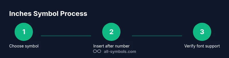
Steps
Estimated time: 10-15 minutes
- 1
Identify the context
Determine whether you are writing for text, math, engineering, or UI design. The context dictates whether inches should be shown with the ″ symbol or a textual form.
Tip: If in doubt, default to the Unicode inch symbol ″ for clarity in professional documents. - 2
Choose the correct symbol
Select the double prime (″) for inches and the single prime (′) for feet. In casual text, you may see a straight quote (") but prefer proper glyphs when possible.
Tip: Always keep inches symbol after the number without a space: 8″, not 8 or 8″. - 3
Insert the symbol
Use your editor’s Insert Special Character function or Unicode input method to place ″ after the number. Avoid auto-replacing with ASCII quotes in final typography.
Tip: On Windows, you can use Alt+2033 to insert ″; on macOS, use the Character Viewer. - 4
Ensure font compatibility
Test the glyphs in the target medium. If a font lacks the glyph, switch to a font that supports it to prevent misinterpretation.
Tip: Preview on all devices where the material will appear. - 5
Provide accessibility
Offer a textual alternative (e.g., '8 inches') for screen readers or contexts where glyphs are ambiguous.
Tip: Add alt text or a long-form measurement when embedding figures or diagrams. - 6
Maintain consistency
Use the same inches notation throughout the document or design system to avoid reader confusion.
Tip: Document your chosen convention in your style guide.
Questions & Answers
What symbol represents inches in typography?
The standard inches symbol is the double prime ″ (U+2033). It’s used after the numeric value to denote inches. Feet are represented by the single prime ′. In plain text, a straight quote may be used, but it is less precise.
The inches symbol is the double prime, ″, used after the number; feet use the single prime, ′.
When should I use in. versus ″?
Use inches with the symbol ″ where typography matters (print, PDF, formatted web). The abbreviation in. is acceptable in casual notes or when space is limited, but it’s less precise.
Use the symbol ″ for inches in typography; in. can be used in quick notes but is less precise.
How can I insert the inch symbol in software?
Most editors provide a Insert Special Character option or a Unicode input method. The symbol ″ is U+2033; you can also copy-paste it from a reliable source. Ensure the font supports this glyph.
Insert the symbol via Unicode U+2033 or copy-paste it; check font support.
What about accessibility and screen readers?
Provide a textual equivalent like '8 inches' for critical measurements. This helps screen readers interpret the value correctly and improves comprehension for all users.
Always include a textual version like '8 inches' for screen readers.
Are there international variations I should know?
Most English-language technical writing uses ″ for inches and ′ for feet. Some languages may spell out units or use locale-specific symbols. Always align with your audience and style guide.
In most cases, inches use ″ and feet use ′, but follow your locale and style guide.
Can I use the straight quote in professional documents?
Prefer the typographic inch symbol ″ for professional work. A straight quote can lead to misinterpretation or layout issues in formal materials.
Avoid straight quotes for inches in professional documents.
Watch Video
The Essentials
- Use ″ after numbers for inches.
- Feet use the single prime ′, not the inch symbol.
- Test glyph rendering across fonts and platforms.
- Provide textual equivalents for accessibility.
- Maintain consistent notation throughout.