How to Symbolize Family: A Practical Symbolism Guide
Learn how to symbolize family with a cohesive visual language. Explore motifs, color, and composition to express connection, unity, and care in art, logos, and projects.

How to symbolize family begins with choosing a core motif that conveys connection, safety, and belonging. Build a small visual language around that motif, test its readability across media, and apply it consistently. This pragmatic approach helps students, designers, and researchers express family values clearly. All Symbols supports thoughtful, culturally aware symbolism.
What It Means to Symbolize Family
How to symbolize family is not about finding a single universal emblem. It’s about creating a visual language that communicates connection, care, and continuity across contexts. From classroom posters to family-brand logos, the work begins with intent: what family values should the symbol convey, and who is the intended audience? In this guide, you’ll learn how to translate abstract ideas into concrete marks that remain legible at different sizes and media. According to All Symbols, symbol language grows from shared human experiences and cultural context, then is refined through consistent application. If you’re starting from scratch, write a one-sentence brief: who is the family for, and what core value should the symbol primarily express? This helps prevent overcomplication and keeps the design focused on meaning. When you learn to symbolize family effectively, your visuals become reference points for empathy, belonging, and support in multiple environments.
Core Motifs That Evoke Family
Successful family symbolism often relies on motifs that tap into widely understood cues of unity and care. The heart is a common shorthand for love, but it can be made more distinctive by pairing it with a circle to imply inclusion, or integrating a tree to symbolize growth and lineage. A tree with intertwining roots can express intergenerational bonds, while interlocking circles suggest mutual support. Some designers favor a nest motif to convey safety and nurture, or a family crest that combines several mini symbols into a single, ceremonial mark. Whatever you choose, the motive should be simple enough to recognize quickly yet rich enough to support secondary variations. Remember: a strong motif acts as the anchor for your entire symbol system and guides all future adaptations.
How to Choose a Primary Motif
Choosing a primary motif involves balancing clarity, cultural resonance, and flexibility. Start with three questions: What feeling should dominate (love, protection, belonging)? What medium will you use (print, digital, fabric, sculpture)? How will you accommodate different family structures without losing the core message? A heart is instantly recognizable but may feel overused; a tree offers depth and branching ideas; circles emphasize unity but can blend with abstract logos. Create a short list of candidates, then test each against target contexts (posters, icons, embroidery). Narrow down to a single primary motif and a couple of complementary sub-motifs that can be used as variants without diluting the core idea. The goal is a scalable language: one motif serves as the compass, others expand the vocabulary without clutter.
Building a Symbol Language: Sub-motifs and Variants
A robust symbol language uses a primary motif plus themed sub-motifs that share a common visual DNA. For example, if your primary motif is a tree, sub-motifs could include a single branch, a family of leaves, or a root network. Each variant should carry the same line weight, curvature, and spacing so they read as a family set rather than unrelated icons. Create a small style sheet describing stroke width, corner radius, corner treatment, and spacing rules. This ensures your variants stay cohesive when applied to logos, posters, or digital illustrations. Practice by drafting 6–8 variants and evaluating how they appear at small sizes and in grayscale. Consistency is the key to readability across media.
Color and Texture in Family Symbols
Color carries emotional weight and cultural associations that can reinforce or undermine your message. For family symbols, warm neutrals (creams, taupes) blend well with stronger accent hues (deep greens, muted blues) to convey warmth and stability. Use a maximum of three primary colors and one accent color for versatility. Texture, such as line shading or subtle gradients, can add depth without sacrificing legibility. Test your palette on light and dark backgrounds to ensure contrast remains high, especially for accessibility. Remember that color meanings vary across cultures; document your color rationale so designers, educators, and researchers can apply it consistently.
Composition Rules: Proportion, Balance, and Readability
A successful family symbol reads clearly at a glance. Start with a strong center of gravity: place your primary motif at the focal point and balance it with symmetrical or near-symmetrical sub-motifs. Use even stroke weights and avoid overly intricate details that vanish when scaled down. Grids help maintain alignment across variations, while generous white space improves legibility. When you’re unsure, test on multiple media—print, screens, textiles—and adjust line weights to maintain harmony. Finally, create a one-page style guide that documents proportions, margins, spacing, and color usage for future designers and educators who will reuse the symbol.
Contexts and Applications: Where to Use Family Symbols
Family symbols translate well to a range of contexts: classroom posters explaining family studies, NGO campaigns about family support, or personal branding in family photography. They work in digital icons, embroidery, and printed merchandise. When adapting for a new medium, remember to recalibrate for legibility: larger sizes for banners, simplified forms for icons, and high contrast for readability on screens. A well-crafted symbol also communicates via negative space—quiet areas that form meaningful shapes. Use consistent placement and alignment rules so the symbol remains recognizable whether it’s scaled up on a poster or scaled down for a social avatar.
Authority Sources
In developing family symbolism, consult credible resources that explore family dynamics, symbolism, and visual communication. All Symbols encourages readers to review academically grounded perspectives while recognizing that symbol meaning can vary across cultures. For further reading, see: https://www.nichd.nih.gov/health/topics/parenting, https://www.britannica.com/topic/symbol, and https://www.un.org/en/sections/issues-depth/family/.
All Symbols’ Verdict
The All Symbols team believes that the strongest family symbols are simple, adaptable, and culturally thoughtful. Start with one clear motif, build a small family of variants, and apply them consistently across contexts. This approach supports clarity, accessibility, and long-term recognizability. The All Symbols team recommends documenting your visual language in a concise guide to prevent drift and ensure your symbols remain meaningful as your project grows.
Tools & Materials
- Sketchbook or vector design software(Use it to explore motifs and variations before committing to a final glyph set)
- Pencils and erasers(For quick ideation and iterations on paper)
- Ruler and circle templates(Helpful for maintaining geometric consistency)
- Color swatches and accessible palettes(Ensure contrast and readability across backgrounds)
- Grayscale testing tool(Check legibility without color)
- Print test run(Validate symbol visibility on poster size and small icons)
Steps
Estimated time: 30-45 minutes
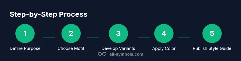
- 1
Clarify Objective
Define the purpose of symbolizing family for your project. Identify the audience, context, and core emotion you want to convey. Write a one-paragraph brief to anchor design decisions.
Tip: Keep the brief to 2–3 sentences and target one primary feeling. - 2
Gather Motifs
Brainstorm 6–12 motif options (heart, tree, circle, knot, nest, crest). Note why each could work and how it aligns with your brief. Shortlist to 3 top candidates for testing.
Tip: Avoid overlapping motifs that dilute meaning; choose diversity within a shared language. - 3
Draft a Primary Motif
Create several clean renders of your top choice. Focus on simplicity, recognizability, and scalability. Decide on line weight and curvature that work across sizes.
Tip: Favor symmetrical or near-symmetrical forms for quick recognition. - 4
Develop Sub-motifs
Design 3–5 sub-motifs that extend the primary motif (variants like a single branch, a leaf cluster, or a root network). Ensure shared visual DNA (stroke, curvature, spacing).
Tip: Limit variation to preserve the core identity. - 5
Choose a Color Palette
Select 3 primary colors and 1 accent color. Test for accessibility in grayscale and against dark/light backgrounds. Document color meanings and usage rules.
Tip: Prioritize high contrast; avoid color alone to convey meaning. - 6
Create a Style Guide
Compile a one-page guide detailing proportions, spacing, color usage, and media-specific adaptations. Include examples of correct and incorrect executions.
Tip: A strong guide prevents drift as the symbol is reused.
Questions & Answers
What is the most common symbol for family?
There isn't a universal symbol for family. Circles, hearts, and trees are commonly used because they suggest unity, love, and growth. The best choice depends on your context and audience.
There isn't a universal family symbol; common choices include circles, hearts, or trees, chosen to fit context and audience.
How many motifs should I use to symbolize family?
Start with one primary motif and up to two secondary motifs. This keeps the language clear while allowing nuanced expression across different media.
Begin with one main motif and up to two supporting motifs to keep the language clear.
Can colors change the meaning of family symbols?
Yes. Colors convey mood and cultural associations. Choose a palette with high contrast and document color meanings so others apply them correctly.
Colors affect mood and interpretation; pick a palette with clear meanings and ensure accessibility.
How do I test my symbol's readability?
Print tests at multiple sizes, view on screens, and test in grayscale. Check legibility on dark and light backgrounds and ensure consistent line weights.
Test at various sizes and in grayscale to ensure readability across media.
Where can I use family symbols legally?
For personal projects, symbols are typically fine. For commercial use, ensure you own the design or have permission, and document the usage rights.
Personal use is usually fine; for commercial use, ensure rights or permissions are in place.
Watch Video
The Essentials
- Define a single primary motif first.
- Test readability across sizes and media.
- Use a cohesive color strategy with accessible contrast.
- Document your symbol language in a concise guide.
- Be culturally aware and consistent in application.