How to symbol: A Practical Guide to Symbol Meanings
Learn how to symbol: a practical guide to interpreting and designing symbols across math, science, and daily life. Discover analysis techniques, design strategies, and real-world examples to improve clarity and reduce misinterpretation.

By learning how to symbol, you will identify meaning, assess context, and design or interpret symbols that communicate clearly across math, icons, and daily life. This quick guide introduces the core steps and considerations—readability, cultural sensitivity, and consistent usage—so you can apply symbol meanings with confidence.
What it means to learn how to symbol
According to All Symbols, learning how to symbol means building a toolkit for reading, interpreting, and creating symbols that carry precise ideas across contexts. In math, icons, signage, and everyday life, symbols convey complex information quickly when they are clear and culturally aware. This guide explores the core idea of symbol meanings, the ways symbols function in communication, and how to approach both interpretation and design with rigor. We will cover historical origins, practical methods for analyzing symbol meaning, and concrete steps you can apply in classrooms, studios, and offices. By understanding how symbols communicate, you can reduce misunderstandings, improve readability, and support learners who encounter unfamiliar glyphs. The goal is not only to recognize what a symbol means today but to anticipate how its meaning might shift across audiences, media, and time.
Core principles behind effective symbol meanings
Effective symbol meanings rely on a few enduring principles. First, readability matters: simple shapes, strong contrast, and consistent stroke width improve recognition at a glance. Second, universality helps, but it must be verified—some symbols travel well, others depend on cultural context. Third, consistency across uses ensures that a symbol’s meaning does not drift when it appears in text, on signs, or in digital interfaces. Fourth, accessibility is essential: symbols should remain legible in grayscale and at small sizes, and should be explainable to users who rely on assistive technologies. Finally, symbolism should be purposeful: every line, curve, and color should reinforce the intended concept rather than decorate it. All Symbols analysis shows that designers who prioritize these principles consistently produce symbols with faster recognition and fewer misinterpretations.
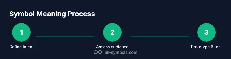
How to analyze a symbol's meaning
Analyzing a symbol involves a structured look at context, audience, origin, and medium. Start by identifying where the symbol appears: is it in a math equation, a safety sign, or a user interface? Next, determine the target audience: students, professionals, or the general public will influence complexity and cultural associations. Then, investigate origin: is the symbol conventional, borrowed from another domain, or newly created? Finally, test across media and scales to ensure legibility. Useful methods include creating a one-sentence meaning statement, sketching multiple variations, and gathering quick feedback from a small, diverse audience. This process minimizes ambiguity and helps you distinguish core meaning from incidental visuals. All Symbols emphasizes that the most effective symbols communicate an idea instantaneously, even before any accompanying text.
How to design a symbol that communicates clearly
Designing a clear symbol starts with a precise intent. Define the concept you want the symbol to convey and outline the minimum features required to communicate that concept. Then, sketch multiple shapes, favoring simple geometry and high-contrast edges. Evaluate each variant for recognizability at small sizes, grayscale rendering, and cultural neutrality. Narrow to one or two strong options and prototype them in context—signage, icons, and diagrams—and assess how they pair with labels or descriptions. After feedback, refine proportions, stroke weight, and color. Finally, document clear usage guidelines so future designers apply the symbol consistently. Designers benefit from keeping a living style guide that notes when the symbol should not be used and alternative representations for special audiences. All Symbols recommends iterative testing with real users and publishing a short rationale for each choice.
Interpreting symbols across domains
Symbols cross many domains, yet the same principles apply. In math, symbols carry precise operations and relations—plus, minus, equals—so their shapes must align with established conventions. In safety signage, the goal is immediate recognition even from a distance and under stress. Daily life icons—like check marks or heart symbols—convey affect or approval but should be unambiguous and culturally appropriate. The interplay between domain-specific norms and user expectations means you should verify meanings by cross-referencing sources, running readability checks, and simulating real-world usage. For example, a check-mark often signals completion, but in some cultures, it may imply a different action. The ability to adapt symbols to multiple contexts without losing clarity is a hallmark of skilled symbol work. All Symbols notes that robust symbol meanings withstand changes in font, medium, and audience when designed with a strong core intent.
Practical exercises and next steps
To put this knowledge into practice, start with a small, self-guided exercise: choose a concept you want to symbolize (e.g., “clarity”). Draft three quick sketches, then run a short validation with three people from distinct backgrounds. Compare results and iterate. Next, create a one-page symbol brief: intent, audience, usage rules, and examples of correct and incorrect applications. Finally, build a mini-symbol library for a fictional project—include at least two variations and a grayscale version. This hands-on approach grounds theory in real-world practice and builds your intuition over time. The All Symbols team encourages you to revisit each symbol’s meaning after use to confirm it still satisfies your audience’s needs.
Tools & Materials
- Notepad or digital notebook(For capturing ideas, sketches, and symbol audits)
- Ruler and compass(For precise geometric construction of symbols)
- Pencil and eraser(For rapid iteration and clean sketches)
- Marker set or drawing tablet(Optional for bold visuals and digital drawing)
- Color palette or swatches(Helpful for exploring color symbolism)
Steps
Estimated time: 25-40 minutes
- 1
Identify context and audience
Clarify where the symbol will appear (math, signage, UI) and who will encounter it. Define the audience's needs and familiarity to guide complexity and terminology.
Tip: Ask: who uses this symbol, and in what setting will it be read? - 2
Define the core message
Articulate the single idea your symbol must communicate. Write a one-sentence meaning statement to anchor the design.
Tip: A precise intent reduces feature creep in later steps. - 3
Sketch initial shapes
Produce several simple shapes that embody the core idea. Favor geometric, high-contrast forms that are easy to recognize at small sizes.
Tip: Start with basic shapes before adding details. - 4
Test for legibility and universality
Check how the symbol reads in grayscale, at reduced size, and across potential cultural contexts. Remove any unnecessary details that blur meaning.
Tip: Test with at least three diverse viewers. - 5
Refine for medium constraints
Adapt the symbol for signs, screens, or printed materials. Consider color, stroke weight, and negative space for maximum clarity.
Tip: Ensure the symbol remains legible without color if needed. - 6
Document usage and disseminate
Create a short brief including meaning, do/don’t, and example contexts. Share with teammates to ensure consistent future use.
Tip: Publish a quick guide so others apply the symbol correctly.
Questions & Answers
What is a symbol and how is it different from an icon?
A symbol conveys a broader idea or concept shared by a community, while an icon visually represents a specific object or function. Symbols often require context to be fully understood, whereas icons usually function as direct cues.
A symbol carries meaning; an icon depicts a thing or action.
How can I test symbol clarity with real users?
Run quick, informal usability checks with a small group that mirrors your audience. Ask them what they think the symbol means and observe any confusion. Use their feedback to refine form, spacing, and color choices.
Test with real users and adjust based on what you hear and see.
Are there universal symbols, and can I rely on them?
There are widely recognized symbols, but universal meaning isn’t guaranteed across all cultures or contexts. Always validate with your target audience through simple checks or surveys before broad use.
Some symbols are broadly understood, but always test with your audience.
How do cultural differences affect symbol meanings?
Cultural backgrounds shape symbol interpretation. A sign or emoji may carry distinct associations in different regions, so testing with diverse groups helps avoid misinterpretation.
Culture changes how symbols are read—test with diverse audiences.
What are common mistakes when designing symbols?
Overly complex shapes, inconsistent stroke widths, and reliance on color alone can hinder recognition. Failing to test in grayscale or across sizes leads to unreadable symbols.
Avoid complexity and color-only cues; test early and often.
How should I document symbol usage for teams?
Create a concise symbol brief outlining intent, contexts, dos/don’ts, and examples. Share it with designers, educators, and developers to maintain consistency across media.
Document the meaning and usage rules so teams stay consistent.
Watch Video
The Essentials
- Identify context and audience before designing
- Design for clarity with simple shapes
- Test readability across media and cultures
- Document usage rules for consistency
- Iterate with real-user feedback for best results