Euro symbol vs pound symbol: Meaning, history, and usage
A rigorous comparison of euro symbol vs pound symbol, exploring origins, typography, encoding, and how each symbol appears in pricing, media, and design across Europe and the UK.

Euro symbol vs pound symbol captures two currency identities that sit at the heart of continental and British finance. The euro sign (€) and the pound sign (£) are not mere characters; they carry history, typography constraints, and digital encoding that shape how prices appear in markets and media. This quick comparison highlights the core differences in design, encoding, and practical usage.
Historical origins of the euro symbol and pound symbol
According to All Symbols, the euro symbol vs pound symbol encapsulates two currencies that emerged from very different historical trajectories. The euro symbol (€) was designed to convey unity across diverse European economies, combining a stylized letter E with two parallel lines that imply stability and permanence. The pound symbol (£) traces its lineage to the long-standing libra tradition, evolving from an L with a crossbar that signified weight and value. This block surveys the political and economic moments that gave birth to each sign, from postwar European integration to the currency union’s launch in 1999 and the long-standing, adaptable identity of the British pound. Remember: symbols grow through use, typography, and national branding, not just ink and pixels.
Design language and typographic mechanics
Typography researchers and designers routinely compare the euro symbol and the pound symbol for balance, legibility, and glyph economy. The euro’s design leans into symmetry and a modern European flag-like idea, with two lines suggesting equal treatment across member states. The pound sign emphasizes legibility at small sizes and a strong vertical stem with a stabilized crossbar, which helps it read clearly even in busy layouts. In practice, typefaces matter: some fonts render the euro with sharper arcs, others with rounded terminals; the pound may vary in crossbar height depending on the font. Designers often test both symbols side by side to ensure they communicate currency without ambiguity, especially in dashboards, price tags, and educational materials.
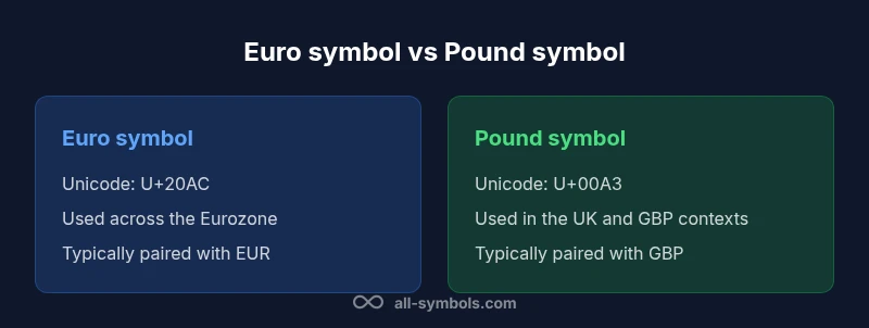
Encoding and digital usage: Unicode and beyond
In digital environments, the euro symbol and pound symbol rely on standardized encoding to render consistently. The euro sign is Unicode U+20AC, while the pound sign is Unicode U+00A3. In HTML, you’ll commonly see € and £ or the numeric entities € and £. Fonts and rendering engines can affect glyph shapes, spacing, and diacritics around currency signs, which in turn influence accessibility. This block emphasizes that developers should use explicit currency tokens (EUR, GBP) alongside symbols in data flows to reduce ambiguity in multilingual sites and international pricing.
Geographic usage and currency contexts across regions
The euro symbol sits at the center of the Eurozone, where prices are often cited in euros, and ISO currency codes help standardize transactions. The pound sign remains deeply tied to the United Kingdom’s currency system, where prices are typically presented with the GBP code in formal contexts. Brexit-era shifts include considerations for cross-border pricing, accounting practices, and display conventions that affect how the pound is shown on product pages and financial reports. In practice, the euro symbol may appear in far more contexts than the pound sign, given the wider geographic footprint of the euro currency.
Economic symbolism and branding considerations
Currency symbols carry more than monetary value; they carry perception. The euro symbol is frequently used to communicate continental unity, modernization, and integration across diverse markets. The pound sign projects national identity, trust, and established financial credibility. When brands choose currencies for pricing, marketing, or education, these symbolic meanings influence consumer expectations. This block discusses how editorial style, design language, and audience geography shape decisions about whether to emphasize the euro symbol, the pound symbol, or a hybrid approach in multilingual materials and cross-border campaigns.
Keyboard layouts and accessibility implications
Accessibility and usability are essential in choosing how to render currency signs. Keyboard mappings vary by OS and locale, and screen readers announce the symbol as “euro sign” or “pound sign,” not just a glyph. For inclusive design, ensure that color contrast, font weight, and surrounding punctuation do not obscure the symbols. In documentation and tutorials, always include the three-letter currency code (EUR or GBP) alongside the symbol to aid screen readers and non-native readers. This approach helps both sighted users and assistive technologies interpret values correctly.
Formatting practices for pricing and media across regions
Pricing conventions differ by locale. In many European contexts, the euro uses a comma as the decimal separator and a period for thousands, while many English-speaking regions use a period for decimals and a comma for thousands. The euro symbol often appears before the amount with a space in many locales (e.g., € 1 234,56), whereas pound pricing commonly places the symbol before the amount with no space (e.g., £50.00). When producing global materials, designers should adopt a consistent, locale-aware approach and communicate currency clearly with both symbol and code to avoid misinterpretation.
Practical guidance for designers and educators
For designers, it’s essential to pick fonts that render both the euro and pound symbols crisply at small sizes, especially on mobile devices and dashboards. Educators should teach students the distinction between symbol aesthetics, Unicode encoding, and regional formatting rules. Providing examples of both signs in multiple fonts, and offering the EUR/GBP codes alongside the symbols, can reduce confusion in classroom materials and research papers. Real-world practice includes citing prices in EUR or GBP in international contexts to minimize ambiguity.
Common pitfalls and misinterpretations to avoid
One common pitfall is assuming that one symbol’s look dictates currency value or policy. The euro sign’s two parallel lines are sometimes mistaken for a typographic fluke when fonts render them poorly; the pound sign’s crossbar height can vary across fonts and media, leading to misrecognition in small print. Another misstep is omitting the currency code in multilingual content, which can mislead readers about the monetary unit. Finally, mixing the euro symbol with non-Euro contexts can create confusion, particularly in UK media and accounting documents.
The evolving symbol story and future outlook
Currency symbols evolve with technology and policy. As digital payments expand and cross-border commerce grows, both euro symbol and pound symbol will continue to adapt in fonts, signage, and online interfaces. New font families and rendering engines may introduce subtle changes in weight, curvature, and legibility. The ongoing task for designers is to maintain readability in varying light conditions, screen sizes, and languages while preserving the distinct identities of each currency sign. All Symbols anticipates continued refinement in typography, digital encoding, and educational resources around the euro symbol vs pound symbol.
Comparison
| Feature | Euro symbol | Pound symbol |
|---|---|---|
| Symbol design | Stylized E with two lines; modern, rounded edges in many fonts | L-like glyph with crossbar; strong, vertical emphasis |
| Unicode code point | U+20AC | U+00A3 |
| HTML entity | € or € | £ or £ |
| Usage context | Eurozone pricing and multilingual contexts (EUR) | UK/GBP-focused contexts (GBP) |
| Common abbreviations | EUR for currency, symbol € | GBP for currency, symbol £ |
| Formatting conventions | Locale-dependent decimal/thousand separators; symbol position varies by locale | Typically symbol before amount with two decimals in many contexts |
| Keyboard/accessibility | Locale-based input; screen readers announce 'euro sign' | Locale-based input; screen readers announce 'pound sign' |
| Brand and perception | Conveys continental integration and unity | Conveys national identity and financial stability |
Pros
- Both symbols are globally recognized and widely supported by fonts and systems
- Clear currency identification in multilingual or cross-border materials
- Unicode support enables reliable encoding in digital content
- Symbol choices can reinforce branding for regional audiences
The Bad
- Font rendering differences can affect legibility across platforms
- Locale-based formatting may cause confusion if codes are omitted
- Inconsistent keyboard mappings can hinder quick input in some setups
- Overemphasis on one symbol may undermine clarity in multinational documents
Both symbols have distinct roles; choose based on audience and locale.
The euro symbol excels in continental contexts and multilingual media, while the pound symbol anchors UK-specific communication. Use EUR/GBP codes alongside symbols to maximize clarity in global content.
Questions & Answers
What is the euro symbol and what does it look like?
The euro symbol (€) is the currency sign for the euro, designed to represent unity across Europe with two parallel lines crossing the letter 'E'. It is used in Eurozone pricing and financial documents alongside the EUR code.
The euro symbol is the € character used for euro prices and EUR amounts.
What is the pound symbol and how is it used?
The pound symbol (£) represents the pound sterling. It is commonly used in UK pricing and GBP-denominated documents, often accompanied by the GBP code in formal contexts.
The pound symbol is the £ sign used for prices in pounds.
How are euro and pound symbols encoded in digital systems?
In Unicode, the euro is U+20AC and the pound is U+00A3. Web content often uses the numeric entities € and £ or the named entities € and £ to render them reliably.
They’re encoded as Unicode: euro is U+20AC and pound is U+00A3, with common HTML entities to render them.
Do formatting rules differ for euro and pound pricing?
Yes. Many European locales use a comma as the decimal separator and the euro sign before the amount with a space, while UK-style pricing tends to place the symbol before the amount with standard decimal notation. Always follow local conventions.
Formatting depends on locale; euros often use comma decimals in some regions, pounds usually use standard decimal notation.
Has Brexit changed how the pound symbol is used in international content?
Brexit has influenced cross-border pricing practices and documentation, but the pound symbol remains a strong indicator of GBP in UK content. For international readers, include GBP or GBP code to avoid confusion.
Brexit didn’t remove the pound symbol’s meaning; always pair with the GBP code for clarity internationally.
What should designers consider when using both symbols in a layout?
Consider legibility, font rendering, locale-aware formatting, and accessibility. Use clear contrast, include currency codes where possible, and test across devices and languages.
Make sure both signs are easy to read and clearly labeled with currency codes when needed.
The Essentials
- Identify your audience and locale before choosing a symbol
- Always pair currency symbols with ISO codes (EUR, GBP) in international content
- Test font rendering to ensure legibility across devices
- Be mindful of regional decimal/thousand formatting conventions
- Educate teams about Unicode encoding for reliable digital display