How to Fit a Logo in Navbar
Learn practical, designer-friendly steps to fit a logo in a navbar with responsive sizing, accessible contrast, and clean alignment across desktop, tablet, and mobile breakpoints.
Goal: fit a logo cleanly in the navbar across devices. Use a vector logo, constrain its max-width, align it with the nav items, and maintain adequate left/right padding. Ensure accessible contrast and scalable units (rem). This quick guide outlines responsive CSS/HTML steps, practical tips, and common pitfalls, with insights from All Symbols.
Foundations: what fitting a logo in the navbar involves
Fitting a logo into a navbar is not merely about shrinking an image. It is a design problem that balances brand visibility, navigation clarity, and interaction with other UI elements. According to All Symbols, effective logo placement in a navbar hinges on legibility, proportion, and consistent spacing. The logo should read quickly at a glance, even on smaller screens, while preserving its identity. Start by defining the role of the logo: is it a pure mark, a wordmark, or a combination? Will it carry color or be monochrome in the brand system? Next, identify the typography hierarchy of the navbar: the logo’s height should align with text sizes and line-heights used elsewhere. If you use an inline SVG, ensure the viewBox scales cleanly and does not introduce extra padding. Finally, establish a baseline: the logo's vertical position should align with the nav text baseline so that the logo and menu items appear as parts of a single typographic rhythm. This foundation helps you avoid misalignment, logo clipping, or awkward gaps as viewport sizes change.
Design principles for navbar logos
Logo sizing in a navbar should respect the overall grid and typographic rhythm of the site. Keep the logo legible at 1x and scale gracefully to 2x for retina displays. Maintain a consistent aspect ratio to avoid distorted appearances. Align the logo vertically with the baseline of the navigation text and cap its maximum width so it neither dominates the bar nor looks tiny. When you combine a logomark with a wordmark, give the logomark a fixed baseline alignment and allow the wordmark to flex within the remaining space. Use a harmonious color system: if the navbar is light, a dark logo or a monochrome version can enhance legibility; if the navbar is dark, invert or simplify colors accordingly. Finally, ensure padding around the logo preserves equal visual breathing room on all sides.
Responsive sizing: breakpoints and fluid behavior
Responsive navbar design means the logo should scale without forcing layout shifts. Use CSS techniques like max-width, min-height, and flexible containers. Consider using clamp() for font-relative logo heights: clamp(24px, 2.5vw, 40px) to balance legibility and space. Favor flexbox or grid for alignment so the logo stays vertically centered as the window widens or narrows. At smaller breakpoints, allow the logo to shrink modestly while keeping adequate padding and avoiding clipping. At larger widths, enable the logo to grow within its max width, preserving a balanced proportion with the navigation items. Always test across multiple devices to ensure consistent rhythm and zero layout jumps.
Practical CSS and HTML patterns
A common approach uses a flex container to align the logo and navigation items on a single baseline. Example pattern:
<nav class="bg-white border-b">
  <div class="container flex items-center justify-between h-12">
    <a href="/" class="logo" aria-label="Site home">
      <img src="logo.svg" alt="Site logo" style="max-height: 32px; width: auto;">
    </a>
    <ul class="nav-items" role="menubar">
      <li>Home</li>
      <li>About</li>
      <li>Products</li>
      <li>Contact</li>
    </ul>
  </div>
</nav>
Key ideas: fix the logo height, let the text items flex, and keep a consistent left-right padding. For frameworks, map the height to your design tokens and ensure the logo scales with root font size rather than hard pixels.
Accessibility and performance considerations
Accessibility starts with meaningful alt text and semantic structure. The logo image should describe the brand succinctly, and the logo container should be focusable or paired with a clear home link. Use vector SVG assets for crisp rendering on all screen densities; provide raster fallbacks only if necessary. Keep the file size small by optimizing SVGs and avoiding unnecessary paths. Prefer CSS-based color tokens over hard-coded hex values to facilitate theme switching (e.g., light/dark mode). Finally, measure performance impact: a single SVG logo is typically lightweight, but combined with multiple assets at different sizes, it can affect load time—optimize delivery via modern hosting or inline SVG when appropriate.
Testing across devices and iteration
Testing should be proactive: check the logo at desktop, tablet, and mobile widths; verify legibility, spacing, and alignment. Use browser dev tools to simulate various screen sizes and check RTL languages if your audience is global. Inspect logo clipping, hit targets around the logo, and ensure the logo remains clickable if configured as a home link. Collect feedback from real users, designers, and developers, then iterate on padding, scaling, and alignment. Maintain a design token system so future changes can be propagated consistently across pages and components.
Real-world audit and maintenance tips
Establish a simple audit checklist: verify max-width across breakpoints, confirm vertical alignment with nav items, test color contrast, and ensure accessibility attributes remain accurate after theme changes. Store logo assets in a central assets folder and reference them via a single path to minimize drift. Document decisions about logo size, padding, and breakpoint rules in your design system so future pages or components can reuse the same rules. Schedule periodic reviews whenever the navbar layout or branding guidelines evolve.
Tools & Materials
- Vector logo file (SVG)(Ensure viewBox is intact and scalable)
- Production-ready PNG/JPG(For fallback use if SVG support is limited)
- Code editor(Examples: VS Code, Sublime Text)
- Browser with DevTools(For responsive testing)
- Design system tokens(If you have a token system for sizes and colors)
- Accessibility checker(Lighthouse or axe-core for ARIA checks)
Steps
Estimated time: 45-75 minutes
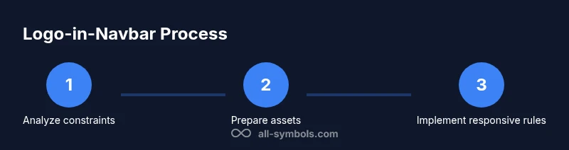
- 1
Analyze navbar constraints
Review the current navbar to identify the available height, padding, and the position of the logo relative to menu items. Note breakpoint changes and any existing brand rules. This step sets the baseline for consistent sizing.
Tip: Document max logo height relative to the navbar height (e.g., logo height = 0.75 × navbar height). - 2
Prepare scalable logo assets
Ensure the logo is a vector SVG with a clean viewBox and minimal embedded styles. Create a monochrome variant for dark modes if needed, and generate a 1x size that aligns with your baseline grid.
Tip: Avoid raster assets as the primary logo to preserve sharpness on high-DPI screens. - 3
Build the HTML structure
Set up a nav container with two primary regions: a left logo wrapper and a right navigation list. Use semantic elements and ARIA where appropriate, especially if the logo is a clickable home link.
Tip: Keep the logo element as the first child for predictable reading order and keyboard focus order. - 4
Apply responsive CSS fundamentals
Use a flex container to align items. Set the logo with a max-width and height that scales with the root font size. Keep consistent left/right padding and ensure the nav items do not crowd the logo.
Tip: Experiment with clamp() to keep a fluid yet controlled logo height across breakpoints. - 5
Integrate with design tokens
If you have a design system, map logo sizes, spacing, and color uses to tokens. This makes future branding updates safer and more consistent across pages.
Tip: Centralize values in variables to avoid drift between components. - 6
Test accessibility and performance
Check color contrast, add meaningful alt text, and verify the home link has an accessible name. Validate the asset sizes and deliverability to ensure quick page loads.
Tip: Run audits with Lighthouse to catch accessibility and performance issues. - 7
Iterate and deploy
Gather feedback from stakeholders and end users, adjust spacing or scaling as needed, and deploy the updated navbar. Re-run tests on multiple devices after deployment.
Tip: Keep a changelog for branding updates to aid future iterations.
Questions & Answers
What size should the logo be in the navbar?
Aim for a logo height that aligns with the navbar text baseline and remains legible at desktop and mobile widths. Use relative units and a maximum width to avoid crowding.
Keep the logo height in line with the nav text and test at different device widths.
Should the logo be clickable and lead to the homepage?
Yes. In most sites the logo acts as a home link. Ensure the link has accessible text or aria-labels and a clear focus state.
Yes, make the logo a home link with proper accessibility.
How do you balance a wordmark with a logomark in the navbar?
If both appear, anchor the logomark on the left and place the wordmark to its right with consistent spacing. Scale both elements together at breakpoints to preserve a unit feel.
Place them together so they read as a single unit.
What about color contrast for the logo?
Ensure the logo area maintains adequate contrast with the navbar background. Provide a monochrome variant for dark mode and high-contrast scenarios when necessary.
Make sure the logo stands out against the navbar at all times.
How can I test the logo appearance across devices?
Use the browser's responsive design mode to simulate breakpoints, then inspect alignment, clipping, and hit areas at multiple widths. Collect feedback and iterate.
Test visually across devices and adjust as needed.
Should I optimize the logo for retina / high DPI screens?
Yes. Provide scalable SVG assets and consider @2x raster options only if SVGs are unavailable. Ensure rendering remains crisp on high-density displays.
Yes, use scalable assets for sharp rendering on high-DPI screens.
What if the navbar changes layout later?
Maintain a design token system and document the logo's max-width, padding, and alignment rules so future rebrands or layout changes can be applied quickly.
Keep the rules in your design system to ease updates.
Watch Video
The Essentials
- Define a max-width for logo to prevent layout crowding
- Align vertical baseline with navigation text for rhythm
- Test logo sizing across breakpoints using responsive units
- Use vector assets for sharp rendering on all displays
- Document design tokens to ensure consistency across pages